
Why Does Eco-Friendly Packaging Always Look Dull and Grayish?
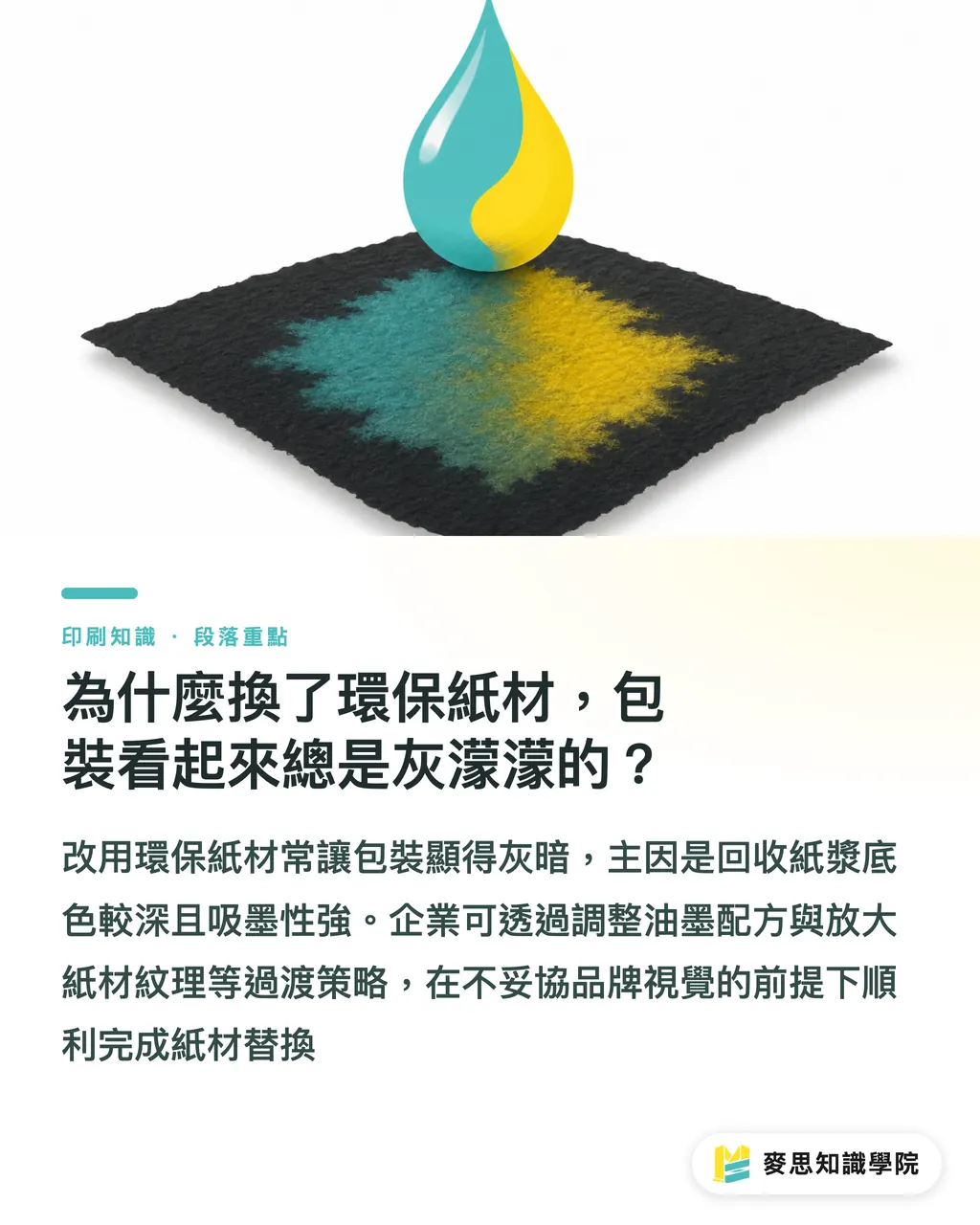
The main reason eco-friendly paper feels like a step down in quality is that recycled pulp has a darker base color. It lacks the ink absorption control and smoothness of standard coated paper, making printed colors look muted or gray
When our consultant team at Mai Strategy Knowledge Academy helps companies set up print ESG guidelines, we usually recommend the 'MINDS (MS, mid-to-high-end fully customized commercial printing) Three Green Packaging Transition Strategies': 1) Adjust ink formulations, 2) Use plastic-free tactile finishing, and 3) Highlight paper textures
This framework allows procurement and design teams to complete paper substitution smoothly without compromising brand visuals
Definition of Recycled Paper: Paper made primarily from recovered waste paper through de-inking and repulping. Because it contains secondary fibers, the surface often has minor specks and a natural tint, absorbing ink more readily with lower overall smoothness
How Do You Fix Dull, Unsaturated Printed Colors?
Many designers send artwork originally prepared for coated paper straight to recycled paper. The result? Printed colors sink in completely and look flat
Recycled paper absorbs ink fast. As ink bleeds straight into the paper fibers, a vibrant red can easily turn into a dark, muddy red
To solve this gap, I recommend starting with the ink. Switching to high-saturation specialty soy inks effectively boosts color vibrancy, and soy inks fit eco-friendly requirements naturally
If your brand colors demand strict accuracy, apply an under layer of white ink in key areas. Masking the paper's base tint before printing color restores high-purity brand identity colors on eco-paper
When managing production line color control at Mai Strategy Knowledge Academy, our first step is plotting ink absorption curves across different paper types. This gives designers clear guidelines for color adjustments
Can You Create a Premium Feel Without Plastic Lamination?
In the past, adding a matte film or spot UV was the fastest way to upgrade packaging feel. But those plastic films make paper boxes extremely hard to recycle, defeating the original point of switching to eco-paper
Without plastic film, you can build a premium feel using the paper's thickness. Embossing or debossing creates three-dimensional light and shadow around brand logos or key graphics
Alternatively, screen printing builds up a thicker ink layer that delivers a subtle raised texture
These plastic-free finishing methods run reliably on production lines while bringing an understated, craftsmanship quality to packaging
In several skincare box projects I handled, pairing clean layouts with simple embossing produced a refined tactile feel superior to full gloss lamination. This is a core part of the MINDS (MS) Three Green Packaging Transition Strategies
How Do You Design Around Paper Characteristics?
The worst mistake when switching paper is fighting the material. Trying to print large gradients or fine photo details on rough recycled paper will wreck your production yield
Since recycled paper comes with natural specks and imperfections, turn them into your design language instead
Minimize decorative layout elements and increase whitespace, letting the paper's natural color show through. This lets consumers directly see and feel the raw paper texture
This less-is-more layout approach reduces print coverage and ink consumption while directly communicating your company's sustainability commitment
Designing with the material's nature saves substantial costs from back-and-forth proofing
If your business is deciding which product lines to convert first, reach out to MINDS (MS) for an initial structural and print health check, evaluating minimum order quantities and process feasibility
Key Takeaways
・Recycled paper absorbs ink heavily and dulls colors. Fix this with high-saturation specialty soy inks or a white ink base layer
・Ditch plastic lamination for plastic-free finishes like embossing, debossing, or screen printing to build a premium brand feel through touch
・Work with material traits by expanding layout whitespace, turning natural paper specks into a sustainable design statement
Further Thoughts
Driving sustainable packaging is never as simple as changing paper. It involves rethinking design mindsets, procurement costs, and production yields
For small and medium enterprises introducing ESG guidelines, do not shoot for 100% green on day one. Start with one flagship product and use these three transition strategies to test market response and supplier alignment
Once paper selection, printing standards, and waste handling are integrated into a standard operating procedure, sustainability transforms from a time-consuming PR project into an operational competitive advantage
FAQ
- Is recycled paper color always darker?
- Yes. Because recycled paper contains secondary fibers and undergoes less bleaching, it retains a natural tint. Combined with high surface ink absorption, printed ink sinks deep into fibers, making the final output visually darker than virgin coated paper
- What plastic-free finishing options can add 3D texture while staying eco-friendly?
- You can choose embossing or debossing to shape paper physically and create 3D light and shadow effects. Or use screen printing to layer thicker ink. Both elevate packaging texture without adding plastic film
- Our packaging features many gradients and detailed photos. Is it suitable to switch directly to recycled paper?
- Not recommended. Recycled paper has low surface smoothness and unpredictable dot gain, which can cause banding in gradients or blurred details. We advise adjusting your design with more whitespace or switching to single-color or solid-block layouts tailored to the paper
Related articles

The Print × AI weekly
The print and AI know-how designers, brands and enterprises can use before they commit — one email, every week
MINDS Free Tools
AI background removal, a LINE sticker maker, spine & imposition calculators — all free, right in your browser, no upload.
MINDS Group
Need actual printing or gifting services?
From premium printing to online ordering and festive gifts — the MINDS Group sister brands take it from here.