
Overview
If custom cards and packaging boxes are going to come out right, the die line has to let designers, printers, and the die maker read the same production blueprint. For my MINDS (MS) print handoff, I run three checkpoints first: die line types, stock structure, and which file version gets delivered
You can remember the MINDS (MS) three-checkpoint handoff this way:
・Line-type check: keep Cut, Crease, and Perforation straight, don't guess what each line does just by looking at it
・Structure check: keep corner radii no tighter than 1.5 mm where you can, and confirm that narrow bridges and sharp points are actually producible before you commit
・Delivery check: PDF goes out for sign-off, the original AI file goes to platemaking and adjustments. Two files, two purposes, don't mix them
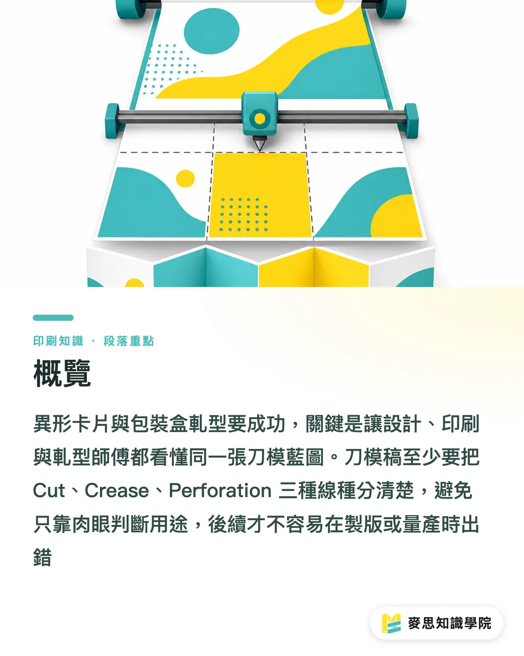
Die cutting is the finishing step where a die presses through, scores, or perforates a printed piece into a specific shape. You'll see it on custom cards, labels, paper boxes, and hang tags
Why does one wrong line on the die file throw the whole box off?
I've watched plenty of buyers walk in with a gorgeous 3D render and ask why the sampled box folds crooked or the tab won't lock. The answer usually isn't on the press, it's that the first line on the die file was wrong
Box forming pulls in at least three things: where to cut through, where to score, and where to perforate or tear. The moment Cut and Crease sit on the same layer, finishing reads "this should fold" as "this should be cut."
Generative AI art can sketch you a nice silhouette, but it doesn't know which way the grain runs, which line needs a score, or which tab needs thickness compensation. Handing a concept render straight to die cutting just pushes all the structural risk onto the sampling stage, where it detonates
On custom box and specialty card jobs, MINDS usually looks at whether the die line can be read independently first. Because if you have to rework the die after sampling, that's four gears grinding at once, design, platemaking, the die itself, and finishing
How should you label die lines so the shop doesn't misread them?
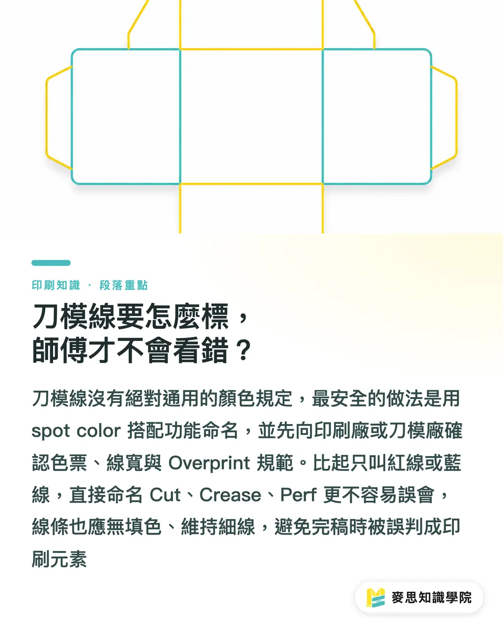
There's no universal color law for die-line labeling, but the trade has its habits. The safest move is naming each line type with a spot color, then confirming the swatch and stroke width with your vendor
・Cut line: usually red or 100% Magenta spot color. The line tells the die to slice through the stock
・Crease line: usually blue or Cyan spot color. The line means a score, not a cut
・Perforation line: usually green, orange, or another dedicated spot color. The line means spaced cuts for tear lines or fold-and-tear
・Stroke spec: commonly used 0.25pt up to 0.3pt hairlines, though the die maker or printer's spec still rules
・Finishing rule: die lines get no fill, just the stroke. Don't make them into filled shapes or outer-frame effects
My own habit: always name die lines by their English function, Cut, Crease, Perf, instead of "red line" or "blue line." Colors shift between people; function names don't get misread as easily
If your vendor asks for the die lines to be set to Overprint, follow that spec exactly. Otherwise the die line can knock out white on the printed art. It's a tiny setting that's easy to miss and very loud when it shows up on the sample
What does a press-ready die layer look like in Illustrator?
The die layer in Illustrator should live on its own, name it Dieline or Diecut, and don't bury it under print, coating, foil, or white-ink layers. In one file, you should be able to spot the print layers and the finishing layers in a single glance
・Build a dedicated layer: put the die line on the very top, with a clear name like Dieline, Cut, or Crease
・No fill on the lines: set Fill to None, keep only the Stroke. A die maker should never see a colored shape that isn't supposed to be there
・Don't substitute guides: Guides are alignment aids, not reliable production lines. They may also drop out of the PDF on export
・Don't rasterize: die lines stay as vector paths. No screenshots, no raster images
・Don't hide them in weird groups: you can lock the die layer to prevent accidental moves, but the vendor still needs to be able to inspect the line attributes
Most mistakes aren't about a designer lacking taste, they come from dragging visual-finishing habits into production files. A die file is judged on whether the line on the factory floor does what it should, not on whether the screen looks tidy
Inside the MINDS (MS) three-checkpoint handoff, I treat the Illustrator die layer as checkpoint one. If that one doesn't pass, talking about stock, bleed, or special finishing is still way too early
How do grain direction, corner radius, and narrow bridges hit yield?
Paper has a grain. When a crease runs parallel to the grain, the fold usually goes down cleaner and the score stays crisp. When a crease runs against the grain, thicker stocks, laminated stocks, and surface-finished stocks tend to crack, wrinkle, or spring back
Grain isn't something your design software solves for you. The way the sheet is cut, the way it's laid out on the plate, and how the box is unfolded all feed into the final fold. If your box has four main creases, at minimum you and your vendor should agree on whether the load-bearing crease should run with the grain
Corner radius is another old headache. Sharp corners look crisp on screen, but after die cutting they fray, tear, or lift. For the outer edge of custom cards and boxes, I'd keep the corner radius no tighter than 1.5 mm unless your stock, die, and finisher have all confirmed they can handle it
Narrow bridges deserve real care, think hang-tag holes, card tips, box-lid tabs, or any necked-down edge on a shaped piece. On screen the difference might look like 1 mm, but in your hand that spot might just snap
Complex custom shapes aren't off-limits. Every extra sharp point, inner notch, narrow bridge, or run of small curves pushes die cost, waste-stripping difficulty, and yield risk higher. For jobs like that, I'd rather run one white sample first than drag the risk straight into production
How should PDF and AI files be handed off to the vendor?
Don't ship a die file as only a PDF, and don't ship it as only the AI source. PDF works for buyers, designers, and clients to sign off on appearance. AI works for platemaking, layout, and the die maker to check line types
・PDF version: use it to confirm visuals, die position, text orientation, bleed, and size. Good for sign-off
・AI source: keeps the layers, spot colors, vector paths, and text status intact, so the vendor can fix or split layers
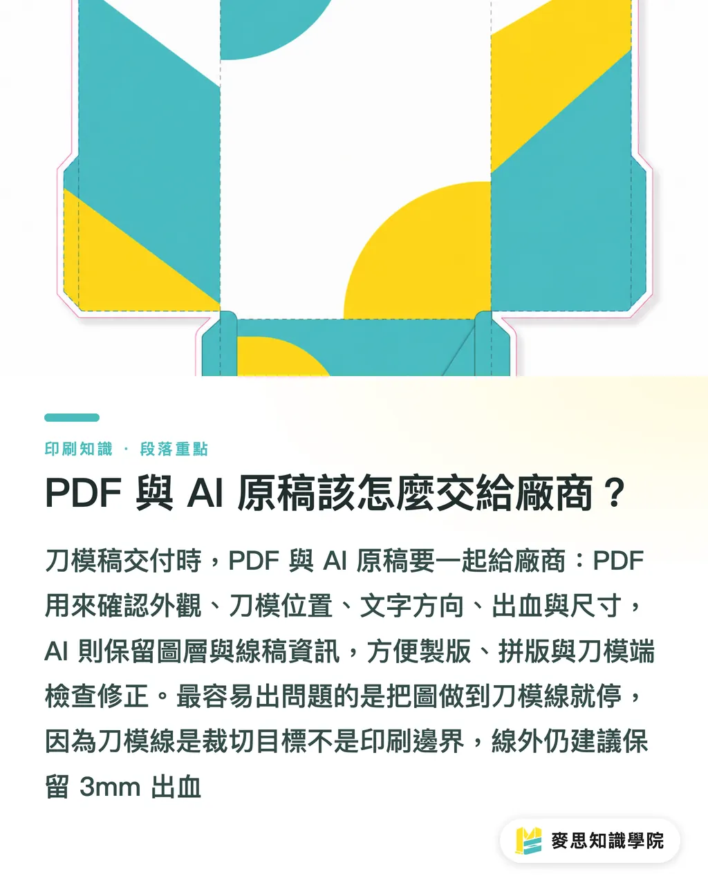
・Bleed setup: keep print bleed beyond the die line. Most commercial printing asks for 3 mm; specialty box structures follow the vendor's spec
・File naming: don't end up with final, final2, newfinal on the same job. Use date and revision, like v03
・Sign-off loop: before production, ask the vendor to send back a die PDF so you can confirm Cut, Crease, and Perf haven't drifted
The jobs that show white edges are usually the ones where the designer stopped the art right at the die line. The die line is a cut target, not a print boundary. If there's no bleed past the die line, any tiny stock tolerance and the underlying color peeks through
For mid-to-high-end fully custom commercial printing, before you hand off to MINDS, get two files straight: one proof PDF with line types marked, and one AI source with layers intact. Communication gets faster, and you're a lot less likely to reopen the die after sampling
Key Takeaways
・One wrong line on a die file doesn't just make the design ugly, it can send a whole production batch back to square one
・If Cut, Crease, and Perforation aren't kept apart, the box structure won't hold
・Keeping corner radii no tighter than 1.5 mm is the basic self-insurance against fraying and tearing on custom cuts
・Bleed has to run past the die line, because the die line is a cut target, not a print boundary
・PDF for sign-off, AI for production. Mixing the two is the fastest way to lose track of who's responsible for what
Where This Goes Next
Finishing management for custom cards and packaging boxes is honestly ripe for turning into a SaaS or an internal check tool. Upload an AI or PDF, and the tool automatically checks for a Dieline layer, whether Cut and Crease are on separate colors, whether bleed is enough, whether sharp points dip below 1.5 mm, and whether bridges are too narrow. For the print manufacturer, that cuts down on the back-and-forth over files. For the designer, it's a second pair of eyes before sending to print. For the buyer, it moves "we caught it at sampling" up to "we fixed it before placing the order."
If the Mai Strategy Knowledge Academy consulting team wants to put this method into practice, I'd start with one checklist. You don't need to build a whole system on day one. Lock down those six items, line types, layers, grain, corner radius, bleed, and PDF/AI files, and a lot of die-cutting failures get halved before the knife ever comes down
FAQ
- Do die lines have to be red?
- Cut is usually red or 100% Magenta, but color is just a communication habit. The better move is naming Cut, Crease, and Perforation with spot colors and confirming the spec with your printer
- Can I use Illustrator guides as die lines?
- Not recommended. Guides are alignment aids, not production lines. Die lines belong on a dedicated layer as un-filled vector strokes
- How big should the corner radius be on a custom card?
- Generally keep corner radii no tighter than 1.5 mm. Anything sharper tends to fray, lift, or tear after die cutting. Thicker and laminated stocks should be even more conservative
- Do I still need bleed beyond the die line?
- Yes. The die line is a cut target, not a print boundary. Most commercial printing asks for 3 mm of bleed; specialty packaging still follows the vendor's spec
- Is a PDF enough when sending a die file?
- No. PDF works for sign-off on appearance. AI source is what preserves the layers, spot colors, and vector paths. For a real handoff, send both
Related articles


The Print × AI weekly
The print and AI know-how designers, brands and enterprises can use before they commit — one email, every week
MINDS Free Tools
Imposition calculator and preflight file check — free prepress tools, right in your browser.
MINDS Group
Need actual printing or gifting services?
From premium printing to online ordering and festive gifts — the MINDS Group sister brands take it from here.