
Where Does a Print Series Most Often Fall Apart?
On the press floor, I have seen far too many projects where each individual piece looks great on its own, but the entire set completely falls apart together. The issue is rarely that the AI cannot generate good-looking visuals. It is that after generating the first image, every subsequent image is generated by 'going with your gut again.' Bringing stickers, packaging, cards, and social media extensions into a cohesive set has never been about aesthetic averages. It comes down to rules. Without clear rules, every new AI generation feels like a brand-new designer took over
Keeping a print series unified comes down to managing five things: compositional logic, typographic hierarchy, illustration style, color ratios, and the rhythm of white space. If any of these five pillars drifts, the entire collection ends up looking 'similar, but off.' In the following sections, I will break down each one and show you how to quality-check your files before sending them to print
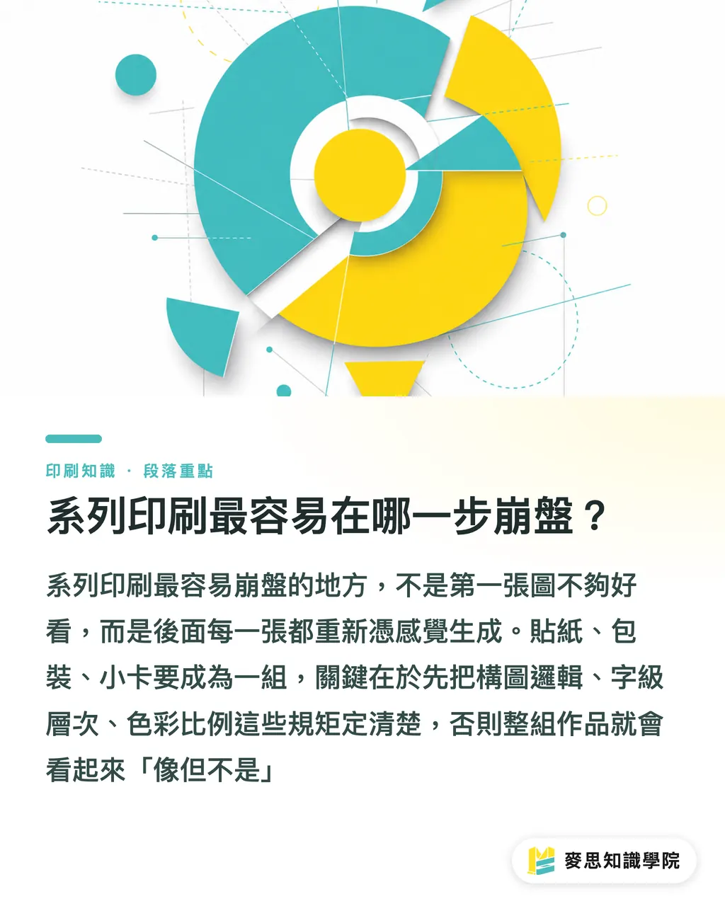
How Do You Anchor an Entire Series with a Single Style Reference?
A Style Reference is the root of whether an entire series stays unified. It is not about finding an image you like for inspiration. It is a master visual that hardcodes strict visual rules, against which all subsequent AI outputs and print runs are evaluated
I recommend that a reference sheet hardcodes at least these elements:
・Compositional framework: Subject placement, visual center of gravity, and negative space ratios, such as 'subject always anchored 30% to the lower-left, top-right always keeps 1/4 white space'
・Typographic hierarchy: Font weight, tracking, and line-height ratios across three levels (header, subhead, body), locked in with exact numbers (such as 48 / 24 / 12 pt)
・Illustration stroke: Line weight, shadow direction, and texture density, specified down to details like '2px stroke, single light source from top-left, no gradient shadows'
・Color distribution: Percentage breakdown of primary, secondary, and accent colors, such as '60% primary, 30% secondary, 10% accent'
・White space rhythm: Safety margins around each layout and minimum spacing between elements, explicitly dimensioned in mm or px
In real-world practice, there are two ways to apply this reference image: generate a visual AI reference to feed into style controls, or draft a design specification sheet attached alongside every file. I prefer doing both together: let the AI reference the image, let the designer check the specs, and verify the proof once more before going on press
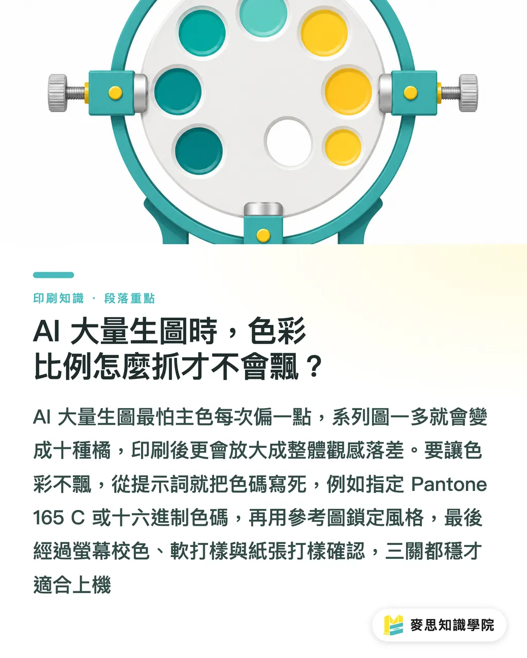
How Do You Control Color Ratios so They Do Not Drift During Batch AI Generation?
Color is the biggest variable in AI image generation. With the exact same prompt, running a new generation can shift your primary color by an entire shade. Across a series, ten images can easily produce ten different versions of 'orange.' That is fatal in print. Once ink hits paper, you are not dealing with a slight 5% screen variance, but an obvious shift across physical color swatches
I recommend locking down color across three distinct layers:
・Prompt layer: Specify Pantone codes or hex values directly in your prompt. Do not just say 'warm orange', write 'Pantone 165 C warm orange.'
・Tooling layer: Use built-in style-locking or image reference features in your AI tool, setting the reference image's color as an anchor so subsequent generations stem directly from it
・Printing layer: Once AI artwork is converted into print-ready files, run it through the color management workflow of [MINDS (MS, mid-to-high-end bespoke commercial printing) three pre-press gates]. Pass monitor calibration, soft proof confirmation, and physical paper proof color matching before going on press
All three layers are essential. If prompts lack specifics, every generation is a gamble. If tools are not locked, your reference image is useless. If the print layer is neglected, no matter how well the first two steps went, converting to CMYK will still throw the colors off. In practice, I have seen countless clients do a great job on the first layer only to fail at the third, resulting in a full batch reprint
How Do You Write Typography and Layout Rules That AI Actually Understands?
Type hierarchy is the most commonly overlooked part of series consistency. People focus on the visuals and forget basic rules like how large the headline, subhead, and body copy should be. Without hard rules, text layouts generated by AI end up doing their own thing in every single piece
Type Hierarchy refers to the structured arrangement of text elements (headlines, subheads, body copy) across size, weight, and spacing within a design. Its purpose is to let readers grasp the primary and secondary information hierarchy in half a second
To feed typography rules to AI, your prompt cannot just say 'make the headline bigger.' You need verifiable specifications:
・Headline: 48pt, Bold, line-height 1.2, tracking +20
・Subhead: 24pt, Medium, line-height 1.4, tracking +10
・Body: 12pt, Regular, line-height 1.6, tracking 0
・Safety margins: 10mm on all four sides, no text allowed inside
Once locked down, paste these specifications at the end of the prompt for every image. AI may not follow them with 100% precision every time, but you will have a clear benchmark to evaluate against, making it easy to fine-tune the layout in Illustrator or InDesign during post-production
Which Elements Must Stay Fixed, and Which Can AI Freely Vary?
The essence of series design is variation within consistency. If everything is identical, it gets boring; if everything is different, the system breaks down. The solution is splitting elements into two categories: Anchor Elements and Variable Elements
Anchor Elements form the brand skeleton and must remain identical across every single piece:
・Logo placement and sizing
・Brand logotype (not just the typeface, but the finalized, custom brand lettering)
・Borders, decorative rules, and layout grid structures
・Designated Pantone swatches
Variable Elements provide the substance of the series, they can change, but never outside the defined skeleton:
・Key visual illustrations (style locked, subject matter can change)
・Copywriting and messaging
・Product photography or environmental scenes
・Seasonal color palettes (must still adhere to primary color ratios)
When building series guidelines for clients, I map these two categories out in a clear table. During AI generation, only the variable fields are allowed to shift. The anchor fields are enforced in the prompt with strict instructions like 'must include' and 'do not replace.' That way, across ten images, the subject matter evolves while the skeleton remains rock solid
What Checkpoints Should You Cover in a Pre-Press Consistency Check?
This is the question I get asked most often. Once your AI artwork is ready, before handing files over to the printer, you must run a full series consistency check yourself. I structure this as the final pre-press checkpoint of the [MINDS (MS) three pre-press gates], divided into three inspection layers:
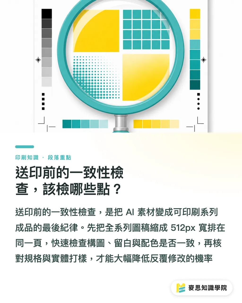
・Visual layer: Scale the entire series down to uniform thumbnails (512px wide) and arrange them on a single page to evaluate composition, white space, and color balance. You can spot 90% of visual drift with the naked eye in this single step
・Specification layer: Compare every piece against the reference spec sheet, verifying type size, line height, spacing, logo dimensions, and Pantone numbers sheet by sheet to catch any incorrect values
・Print layer: Pull the most complex layout and produce a physical proof to verify CMYK conversion, paper color rendering, and ink coverage. Once approved, run the rest of the batch using the exact same press settings
If your files pass all three layers, the likelihood of pre-press issues drops from the usual 'three rounds of revisions' down to 'getting it right on the first try.' At the end of the day, AI produces raw assets, not finished products. Turning raw assets into a print-ready series comes down to disciplined pre-press preparation
Key Takeaways
・Consistency in print series does not rely on an aesthetic average, but on hardcoded rules
・A Style Reference must lock down five core pillars: composition, typography, illustration, color, and white space
・Colors require three layers of control: specify Pantone in prompts, lock reference images in your tools, and verify through physical print proofs
・Typographic hierarchy must be defined with verifiable numbers, not vague subjective adjectives given to the AI
・Clearly separate anchor and variable elements: logos and standard brand colors never move, while key visuals and copy can change
・Always run a side-by-side thumbnail check before printing; 90% of visual drift can be caught instantly by eye
Industry Perspective
Looking at real-world production, what AI really changed was never whether someone can draw, but the speed of volume output. With production accelerated, the old workflow where one designer monitored a single seasonal campaign has shifted to one designer launching ten series simultaneously. Under this pace, what fails most often is not individual artwork quality, but the variance across the entire batch
Next steps for print manufacturers: Turn 'series consistency checks' into a standard onboarding intake questionnaire, asking clients whether they have reference visuals, typography specs, and Pantone numbers, and guiding them to fill gaps if they do not. Next steps for design teams: Instead of reinventing the visual wheel for every run, spend half a day building a solid reference sheet and specification table. The production hours you save over the coming year will be immense
To learn how to start building concrete series guidelines and how detailed your prompts should be, consult directly with the Mai Strategy Knowledge Academy advisory team to get your workflow running smoothly
Further Reading
(This article is original educational content. The brand color management concepts and pre-press workflows referenced represent general industry standards, with no citations from specific external publications.)
FAQ
- Can AI-generated images be sent directly to print as a series?
- Yes, but you must first establish a Style Reference and clear spec sheets for typography and color. AI should only produce raw assets that meet those specifications, rather than deciding the visual rules of the series on its own
- Why do images generated from the same prompt show different colors each time?
- AI image generation is fundamentally based on probabilistic sampling, where inherent randomness causes slight hue shifts in every run. The fix is hardcoding Pantone numbers or hex color codes directly into the prompt, while using tool-level style-locking features to anchor the reference image's color palette
- What is the single most important pre-press check before printing a series?
- Viewing all series thumbnails side by side. This step reveals inconsistencies in composition, white space, and color harmony within 30 seconds, making it far more efficient than inspecting each file in isolation
- What is the difference between a Style Reference and a regular mood board image?
- A mood board image serves as visual inspiration, whereas a Style Reference acts as a verifiable design specification. A reference must hardcode exact numbers and rules for composition, typography, illustration style, color ratios, and negative space to serve as an anchor for all future production
- How do you control costs on short-run series printing?
- Isolate variable elements at the print level (such as swapping only key visuals and copy) while keeping anchor elements on the same plate-making and color setup. This avoids paying steep fixed plate-making setup fees for every variation
Related articles



The Print × AI weekly
The print and AI know-how designers, brands and enterprises can use before they commit — one email, every week
MINDS Free Tools
AI background removal, brand stamping, and a LINE sticker maker — free design tools, right in your browser, no upload.
MINDS Group
Need actual printing or gifting services?
From premium printing to online ordering and festive gifts — the MINDS Group sister brands take it from here.