
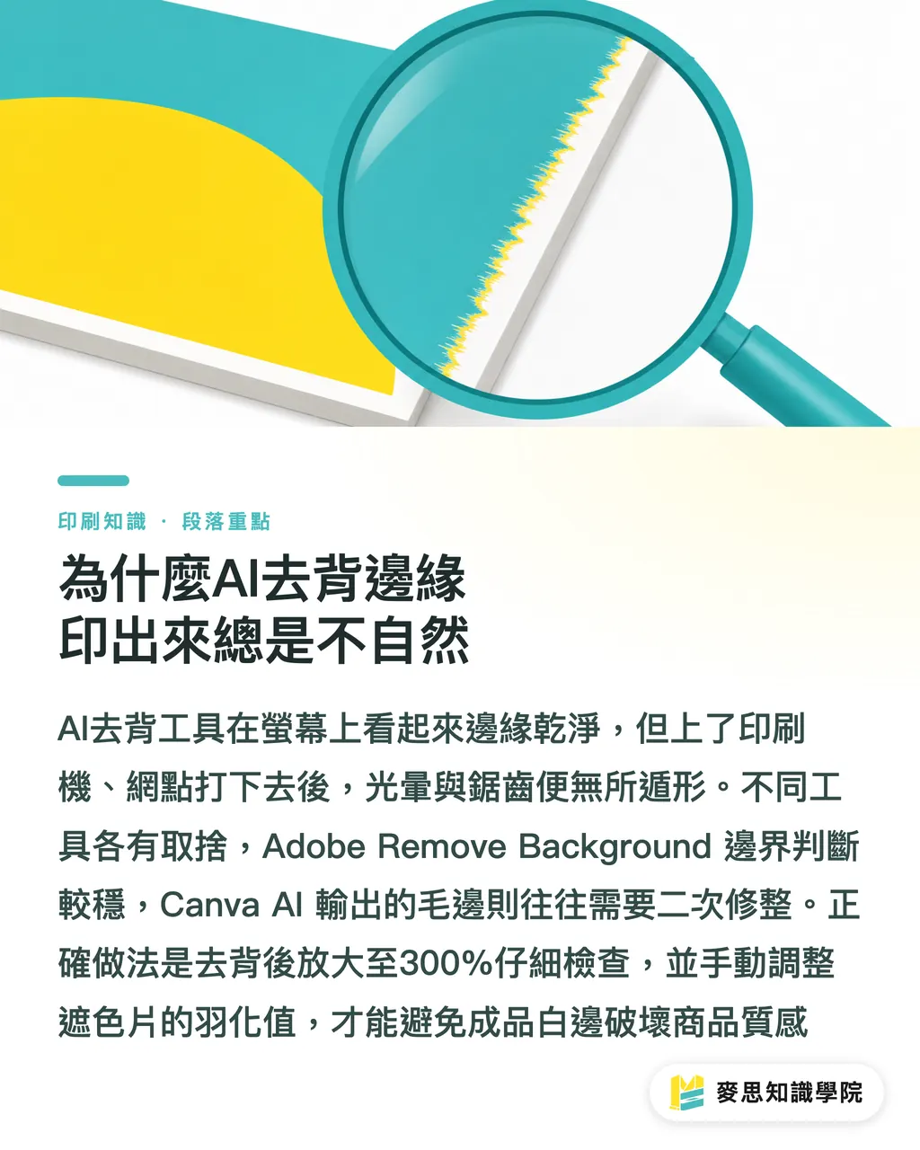
Why AI-removed backgrounds always look unnatural in print
Lately, my desk has been piled high with proofing samples for catalogs that clients edited and laid out themselves using AI. The most common issues flagged are the strange halos and jagged edges around products
To save time, most sellers use one-click background removal tools. However, edges that look clean on screen reveal their flaws the moment they hit the printing press and the halftone dots are applied
Comparing common tools currently available, Adobe Remove Background is relatively robust in edge detection and is suitable for hard-cased products with sharp edges
Remove.bg is the fastest, but it tends to lose details when encountering reflective materials
Canva AI is great for social media content; however, if you plan to print, its output edges often require secondary processing
The correct approach is to zoom in to 300% after background removal to inspect the edges, and use masking to manually fine-tune the feathering. Otherwise, white fringes on the printed product will significantly diminish its quality
Can AI-generated ambient lighting really replace studio lighting?
For small and medium-sized sellers without the budget for a photography studio, using Adobe Generative Fill to generate ambient light and reflections for products on white backgrounds is currently very popular
While this looks dazzling on a webpage, I must warn that AI-generated shadows often contain muddy, dirty colors when converted to the CMYK color space
When AI attempts to simulate ambient light, the resulting pixel structure is often overly complex, which can easily cause excessive ink coverage or color casts during four-color process printing
If you must retain AI-generated shadows, be sure to move them to a separate layer in Photoshop, convert them to monochrome black (K channel), and lower the opacity
This way, the printed shadows will be clean and crisp grayscale, rather than a muddy mess with reddish or greenish tints
Colors look accurate on screen, so why is there a major color shift in print?
This is a pain point I have to explain to clients several times a month
Most AI photo editing tools operate in the RGB environment, which means the color vibrancy they generate far exceeds the CMYK gamut a printing press can produce
When you finish adjusting the product's colors with AI tools and send the file directly to the printing house, a color shift is almost inevitable
The correct color management workflow is to convert the file to the printing house's specified CMYK profile (such as the commonly used Japan Color 2001 Coated) after final edits are confirmed
After conversion, be sure to turn on 'Gamut Warning' to check if the main product subject has areas where colors overflow, and pull them back into a safe range by adjusting saturation or using color selection tools
For brand identification colors or products with extremely high color requirements, I strongly recommend doing digital proofing before submitting for mass printing
Why is the background of a white-based product photo not white enough when printed?
Many designers mistakenly believe that after removing the product background and dropping it onto a white canvas, the printed result will be a perfect white-background catalog
In practice, paper itself has a 'paper white,' and different materials (such as coated paper versus offset paper) have completely different base colors and ink absorbency
If you do not ensure that the CMYK values of the background are an absolute 0 when processing white-based product photos, the printing press will spray very light dots during full-page printing, causing the background to look like a layer of gray, dirty stains
Another key factor is resolution. To ensure that product details on the catalog are clear, the minimum resolution threshold for files sent to print must be 300 dpi
For large, full-page images that span across spreads, it is even recommended to increase this to 350 dpi. These are hard benchmarks that one-click AI processing cannot automatically safeguard for you
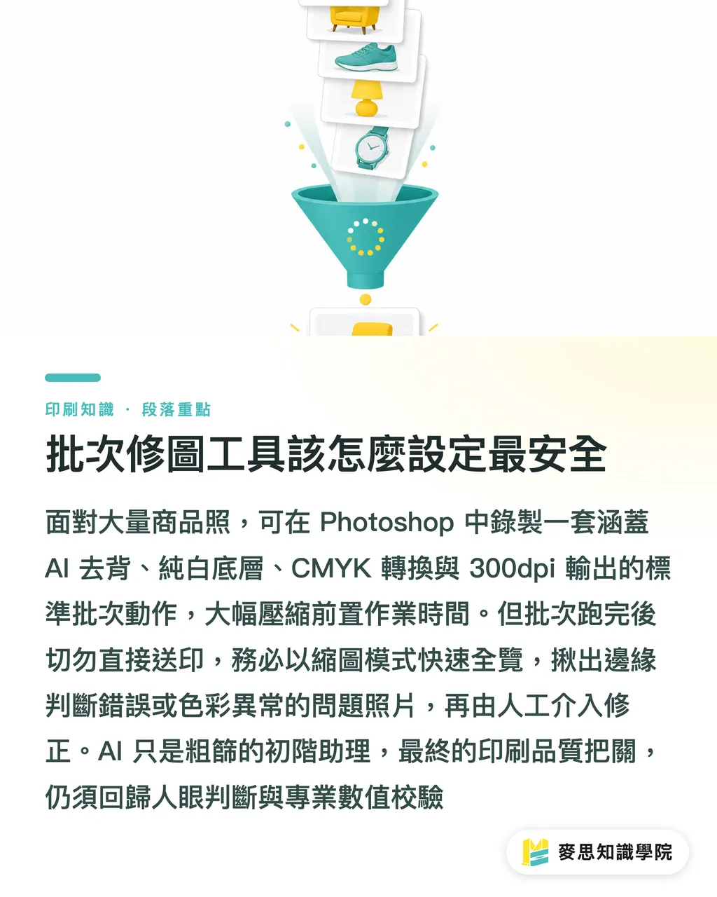
What is the safest way to set up batch editing tools?
When facing hundreds of product photos, manually removing backgrounds and adjusting lighting one by one is definitely not time-efficient
For the past six months, I have often recommended that clients use Photoshop's 'Actions' feature combined with AI background removal commands to handle batch operations
You can record a standard action that includes 'Select Subject, Remove Background, Add Pure White Background Layer, Convert to CMYK, Adjust Image Size to 300dpi'
However, be aware that you should not send files directly to print after batch processing. Be sure to use thumbnail mode to quickly browse the entire set, and pick out 'failed' photos—where edges were incorrectly judged or colors are abnormal—for manual correction
Treat AI as a junior assistant for rough filtering; the final level of quality control must still rely on human eyes and confirmation of professional printing values
Key Takeaways
・AI background removal tools often leave fringe artifacts on edges; zoom in to 300% to inspect and fine-tune feathering values before sending to print
・AI-generated ambient light and shadows can easily cause muddy four-color process printing; be sure to convert shadows to monochrome black
・After image finalization, you must actively convert to CMYK and check Gamut Warnings to avoid severe color shifts caused by exceeding print limits
・The CMYK values for the background of white-based product photos must be absolute 0 to prevent the paper from printing with gray, light-colored halftone dots
・Batch processing can solve 70% of tedious work, but final checks for size, resolution, and details still require human oversight
Further Reflection
For small and medium-sized brands, AI tools have indeed significantly lowered the barrier to producing product photos, making high-quality catalogs no longer an unattainable investment
However, there is still a massive gap between screen display and actual printing in terms of color science and physical printing characteristics
When introducing an AI editing workflow, it is better to position AI as an assistant to accelerate pre-work, and invest the time saved into precise color management and proofing confirmation
The prepress team at Minprint checks these blind spots left by AI editing for our clients every single day. As long as you master the correct file processing specifications, you too can print professional-grade, high-quality catalogs at a reasonable cost
FAQ
- Which common AI background removal tool is best suited for printed materials?
- Adobe Remove Background is relatively precise in its judgment of edge details and hard-cased products, and is less likely to produce severe fringing after being printed
- What should I do if the lighting and shadows generated by AI for product photos look dirty when printed?
- AI-generated shadows often contain a mix of multiple colors in CMYK; you must separate the shadow layer in Photoshop and convert it to monochrome black (K channel) to ensure clean grayscale output
- Why do product photos that look very vibrant on screen look gray when printed?
- AI photo editing defaults to the RGB color gamut, which has a larger color range than the CMYK used for printing. Failing to convert profiles and address gamut warnings before printing will cause obvious color differences
- What is the minimum resolution requirement for product photos sent to print?
- Regardless of how high-definition AI editing tools claim to be, for actual printed output, the resolution of the image file must never be lower than 300 dpi