Overview
Everyone has been asking what all the AI art hype is about lately — the truth is, it has already become a standard tool for accelerating early-stage pitches and cutting down on communication overhead
But in the world of physical print, the real daily pain points the industry is solving for are insufficient resolution and color drift
Why the Design World Has Gone Wild Over AI Art in the Past Two Years
If you've commissioned any design work recently, you've probably noticed designers delivering first drafts faster than ever
Getting three directions of visual composites used to mean spending three to five days sourcing and piecing together stock images
Now, a few well-crafted prompts can produce professional-grade commercial mockups in under an hour
・Concept alignment: Clients can react to concrete visuals on the spot instead of trying to imagine something from scratch
・Style testing: Switch between watercolor, 3D, and minimalist looks on the fly to quickly zero in on the brand's visual language
From the projects I've worked on recently, teams that know how to treat AI as a tireless creative assistant cut their early-stage communication time in half
Can Images from Free AI Tools Be Sent Directly to Print?
This is the most common pain point clients ask me about — and in practice, going straight to print almost never works
To save on computing costs, most mainstream free AI tools output images at around 1024×1024 pixels
That looks sharp on a phone screen, but printing a standard A4 sheet requires a minimum of 2480×3508 pixels
Force-scaling the image results in pixelation and blurry edges — something that will get flagged and rejected at the print shop's preflight check without exception
・Essential prep step: Run the image through an AI upscaling tool (such as Topaz or Upscayl) for lossless enlargement before doing anything else
・Check structural details: Before sending to print, open the file in Photoshop and manually fix any extra fingers or distorted background text
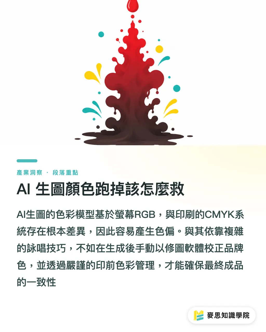
How to Fix Color Shifts in AI-Generated Images
The tools keep getting more powerful, but the colors they produce always end up being "close but not quite" your brand colors
I've seen countless clients in the office complain that the red in their AI-generated artwork printed too dull, or the blue came out muddy
That's because AI models are built on the world of RGB screens — they have no concept of CMYK printing inks or Pantone spot colors
・Lock in your brand colors: Aim for a rough color in the AI prompt, then always use image editing software afterward to repaint your official brand colors back in
・Never skip a proof: Since the source is randomly generated RGB color, always request a physical digital proof before the final print run
Keeping brand colors accurate and consistent isn't about writing more elaborate prompts — it comes down to solid prepress color management fundamentals
Key Takeaways
・AI's greatest value lies in narrowing down visual direction and supporting pitches in the early stages — think of it as a tireless creative assistant
・Free AI image files are never print-ready as-is; lossless upscaling and detail correction are mandatory before sending to press
・AI doesn't understand physical ink — brand color accuracy must be handled through downstream CMYK conversion and precision proofing
Food for Thought
Don't treat AI as a button that replaces designers — treat it as the lubricant that keeps design and print workflows communicating smoothly
The future of design and print services won't be won by who can write the best prompts, but by who can seamlessly bridge the last mile between virtual image generation and physical manufacturing
For integrated-service print platforms, the ability to automatically detect AI image resolution at upload and offer lossless upscaling suggestions would be a genuinely compelling competitive differentiator
FAQ
- Will business cards come out blurry if I send AI-generated images directly to the printer?
- They will — the native output resolution is far too low. It's recommended to upscale the image by at least 2 to 4× using dedicated software and convert it to CMYK before laying out and sending to press
- Why do gradients in AI-generated images appear banded or come out darker when printed?
- Because AI generates images in RGB color space for screens. When converted to CMYK for printing, bright colors get hard-compressed. It's best to manually fine-tune contrast and saturation in your image editing software beforehand
- Can I ask a print shop to match the colors in my AI image exactly to what I see on screen?
- An exact physical match to a glowing screen is physically impossible, but through professional prepress color matching and proofing, the color difference can be brought within a range that's acceptable to the naked eye