Overview
Una, ang konklusyon: kung kaya i-print ang AI poster, hindi ito tungkol sa output mismo, kundi sa tatlong hakbang pagkatapos: color conversion, resolution enhancement, at file reconstruction
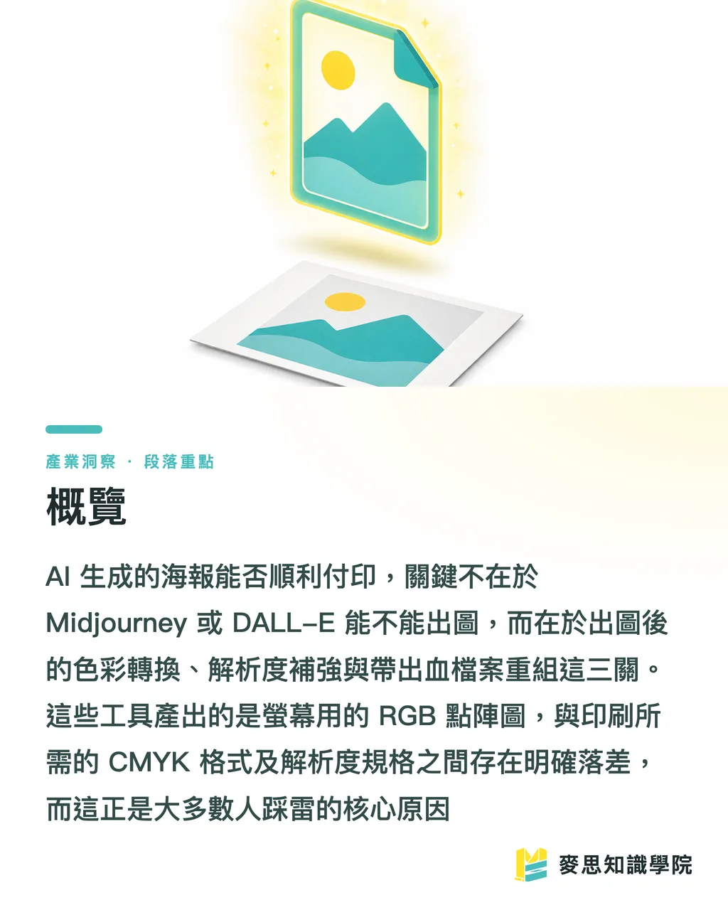
Ang Midjourney at DALL-E ay gumagawa ng RGB raster image para sa screen, ngunit ang printing ay nangangailangan ng CMYK, sufficient resolution, at controllable file na may bleed. Dito nagsisimula ang karamihan ng mga problema
Bakit Umuusad ang Kulay ng AI-Generated Poster Kapag Na-Print?
Ang pinakakaraniwang reklamo ay "Maliwanag at vibrant sa screen, ngunit ang print ay mukhang matunaw at madusog."
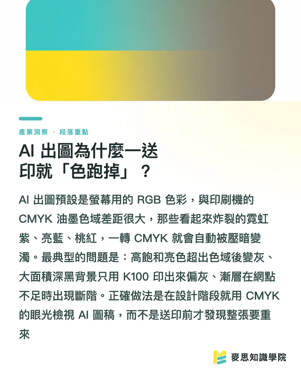
Simple ang dahilan: Ang Midjourney at DALL-E ay default sRGB RGB output, pero ang printing machine ay CMYK four-color inks
RGB ay mixed light, may mas malaking color gamut kaysa sa inks, lalo na ang neon-like vibrant blue, green, magenta — hindi kaya i-print ng CMYK
Sa nakaraang taon o dalawa ng AI poster projects na hawak ko, ang easiest to mess up ay ang cyberpunk neon style — ang explosive purple-red-blue sa screen ay bumaba ng isang level pagkatapos mag-convert sa CMYK
Mga specific cases kung saan umuusad ang kulay:
・High-saturation RGB bright colors na lumalampas sa CMYK gamut, pagkatapos mag-convert ay automatically nagiging darker at more muted
・Large area deep black background kung K100 lang, ang print ay magiging grayish; kailangan ng 'composite black' (tulad ng C40 M30 Y30 K100) para maging dense
・Gradients na smooth sa screen ay makikita ang banding (one-ring-after-another steps) kung insufficient ang printing dots
Kaya ang correct order ay: tingnan ang AI output gamit ang CMYK perspective pa habang nasa design stage, huwag maghintay hanggang sa pre-print para malaman na kailangang muling gawing lahat
Pagkatapos ng Midjourney/DALL-E Output, Ano ang Unang Hakbang?
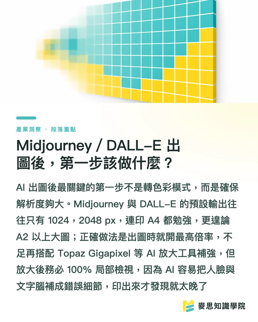
Hindi agad i-convert sa CMYK, first, 'save the image to sufficient size.'
Ang pinakamatinding problema ng AI image ay resolution
Ang basic printing requirement ay 300 DPI, meaning isang A2 poster (420 × 594 mm) ay kailangan ng roughly 4960 × 7016 px
Pero ang Midjourney usually outputs 1024 to 2048 px sa long side, DALL-E common ay 1024 × 1792 — struggling na ito i-print sa A4, mas lalo pa sa A2, A1
Practical enhancement steps na pwedeng gawin:
・Gamit ang highest resolution setting sa tool mismo (Midjourney's Upscale, kasama ang repainting parameters) para i-boost ang base resolution mula pa lang
・Kung hindi pa enough, gamitin ang AI upscaling tools (Topaz Gigapixel, Magnific, etc.) — sila ay 'rebuilding details' hindi lang stretching, malaking difference
・Pagkatapos mag-upscale, tingnan ng 100% ang parts — AI upscaling ay madalas na mag-'hallucinate' sa faces, text, signs into weird artifacts, at makikita sa printing
Ang rule of thumb ko: para sa A3 at below poster, ang original image long side dapat at least 3000 px bago mag-usap ng printing; mas malaking output, mas dapat high-res pa-lang ang start, ang after-fix ay mas mahirap palagi
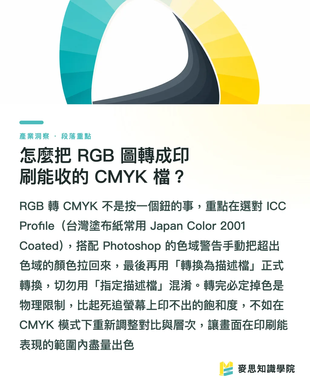
Paano I-Convert ang RGB Image sa CMYK para sa Printing?
Core concept sa isang sentence: color conversion ay hindi 'i-click lang ng button,' dapat i-select ang right ICC profile at manual color correction
Standard workflow sa Photoshop:
・Una, gamitin ang 'Proof Setup' para ma-simulate ang printing colors, piliin ang tamang ICC profile — most Taiwan printers ay kumikita ng Japan Color 2001 Coated (coated paper) o ang non-coated version
・I-on ang 'Gamut Warning,' ang gray-marked areas ay color na hindi ma-print, i-adjust manually ang saturation at brightness pabalik sa gamut, mas better control kaysa automatic software compression
・Confirm okay na, then i-'Convert to Profile' para mag-formally convert sa CMYK, hindi 'Assign Profile' — very different results
Siguradong babagsak ang vibrancy after conversion — yan ay physical limitation, hindi ka nag-error
Instead na habulin ang screen saturation na hindi puwedeng i-print, mas better mag-adjust ng contrast at value sa CMYK mode para maging best-looking siya 'within printing's representable range.'
Paper material ay kumakain din ng color: ang same file na i-print sa glossy coated paper vs. regular uncoated paper ay completely different saturation at ink density — i-confirm sa printing shop kung anong paper bago mag-submit, ideal ay may digital proof color-matching bago mag-submit
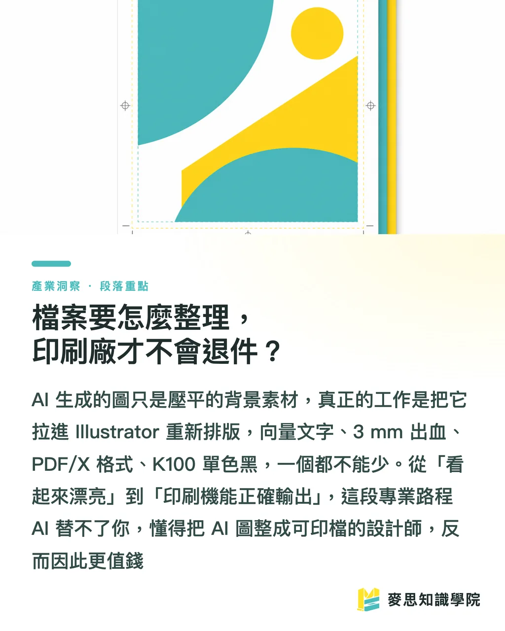
Paano I-Organize ang Files Para Hindi i-Reject ng Printing Shop?
Ang AI output ay isang 'flattened raster image' — pwedeng gamitin pero not professional; ang truly editable at printable file ay kailangan mag-reassemble
Key actions:
・I-place ang AI image bilang 'background asset' sa Illustrator o InDesign, titles, logos, event info ay vector separate, huwag hayaan na i-generate ng AI ang text (AI sa Chinese ay halos always messes up — blurry, missing strokes, weird self-invented characters)
・Mag-leave ng 3mm bleed sa bawat side, important text at graphics ay inward, avoid na ma-cut off sa trimming
・I-export bilang PDF/X-1a o PDF/X-4 standard printing format, i-convert ang fonts to outlines o i-embed, maintain ang images sa 300 DPI
・I-set ang black text as K100 single-color black, hindi CMYK composite, otherwise small text ay may 'ghosting' dahil sa misalignment
Bumabalik din ito sa essence ng graphic design work: hindi tungkol sa paggawa ng magandang image, kundi converting 'what you see on screen' into 'what the printer can correctly output.'
AI ay tumutulong na lampasan ang 'creating beautiful visual' part, pero mula pretty hanggang printable, ang professional work ay nandito pa
Ito rin ang dahilan kung bakit sinasabi ko, AI na makagawa ng image ay hindi designer replacement — ang taong kayang mag-convert ng AI image into printable file, expert sa color management at post-processing, mas valuable pa
Aling Poster Types ang Suitable para sa AI, at Aling Hindi?
Hindi lahat ng poster dapat i-delegate sa AI, clear separation ay makakatipid ng malaking rework
Suitable scenarios:
・Stylized visual main image, background illustration, strong-atmosphere event posters — AI ay mabilis at creative
・Internal events, social media posts, short-term promotions na high-tolerance sa errors
・Proposal phase, gumamit ng AI para quick maka-generate ng tatlo o limang directions para sa client, then detail-refine bago mag-submit
Scenarios na dapat cautious o avoid:
・Need precise brand colors (Pantone spot colors) para sa brand identity materials — AI ay hindi kontrolado, need professional design plus spot color printing
・Maraming Chinese text, kailangan ng precise typography sa DM, catalogs
・Kailangan ng 'flawless realistic' people, products replacing commercial photography — AI hands, textures, brand details ay madaling ma-expose
Most practical approach ay 'AI creates concept, people add professionalism:' hayaan ang AI para sa eye-catching main visual, color management, typography, bleed, post-processing ay ipa-handle sa expert o vendor
Ito rin ang value ng all-in-one integrated printing service — mula file audit, digital proof color-matching hanggang post-processing, walang middleman chain breaks
Key Takeaways
・AI poster print success ay hindi stuck sa output, kundi sa three post-output steps: color conversion, upscaling, reconstruction
・Midjourney/DALL-E ay sRGB raster, printing needs CMYK — high-saturation bright colors ay guaranteed na babagal ng level, design na may CMYK perspective pa lang
・Printing baseline ay 300 DPI, A2 poster ay roughly 4960 × 7016 px, kung original ay insufficient, muna high-res output then AI upscale, after upscale ay check 100% para sa artifacts
・CMYK conversion ay kailangan right ICC profile (Japan Color 2001 Coated common sa Taiwan) at gamut warning manual correction, hindi automatic software squash
・Huwag hayaan ang AI mag-generate ng text, gamitin ang AI image bilang background, titles logos ay vector separate, mag-leave ng 3mm bleed, mag-export bilang PDF/X
Further Considerations
Para sa design at printing professionals na mag-integrate ng AI, one practical next step: hindi i-position ang AI bilang 'designer replacement machine,' kundi bilang 'tool na nag-accelerate ng early creative stage at nag-reduce ng proposal costs' — ang real moat ay nasa later-stage color management at printing engineering
Practically, could be done: mag-create ng sariling company 'AI output to print-ready' checklist (resolution, color mode, bleed, text vectorization, ICC profile), hayaan ang designers mag-self-check bago submit, rejection rate ay agad bababa
Para sa integrated service providers, ito ay cutting point: customer ay may pretty pero non-printable AI image, ikaw ay tumutulong na i-complete ang last-mile mula digital proof color-matching hanggang post-processing — ang 'ability na gawing real product ang AI image,' short-term ay AI mismo ay di matuto nito
FAQ
- Pwede ba agad i-send ang Midjourney image sa printing?
- Hindi recommended agad i-submit. Ang Midjourney ay default sRGB raster image output, resolution ay madalas below 300 DPI, kailangan pa ng AI upscaling, CMYK conversion with color correction, plus bleed at vector text reconstruction bago safe na i-print
- Ano ang gagawin kung ang AI poster ay naging gray at muddy kapag na-print?
- Ito ay dahil sa color gamut gap sa RGB-to-CMYK conversion — high-saturation bright colors ay impossible i-print, solution ay i-open ang gamut warning sa Photoshop at manually i-pull back ang out-of-range colors, plus i-select ang right ICC profile (Japan Color 2001 Coated common sa Taiwan coated paper), ideal ay may digital proof color-matching bago mag-submit
- Paano kung ang AI-generated poster resolution ay insufficient para sa large printing?
- First, gumamit ng highest resolution setting sa output tool para i-boost ang base resolution, then complement gamit ang AI upscaling tools like Topaz Gigapixel o Magnific na nag-rebuild ng details instead of simple stretching, pagkatapos ay inspect 100% ng sections, A3 below poster ay ideally 3000+ px minimum sa long side
- Pwede bang i-generate ng AI ang text sa poster?
- No — AI-generated Chinese text ay almost always blurry, missing strokes, o weird self-invented characters. Correct approach ay gamitin ang AI image bilang background asset, titles, logos, event info ay i-layout separately gamit ang Illustrator o InDesign sa vector form
- Aling posters ay suitable para sa AI, at aling hindi?
- Stylized main visuals, atmospheric backgrounds, social media short-term materials ay suitable para sa quick AI generation, pero para sa Pantone spot color brand identity, DM na may detailed Chinese typography, o commercial imagery na need realistic flawless quality, hindi recommended — kailangan pa ng professional design at printing oversight