
Overview
Extending one key visual across multiple sizes cannot mean scaling the original visual up and down and sending it to print. The right way is to use the six-step key visual extension method commonly used by MINDS Printing (MS, mid- to high-end fully custom commercial printing): ① confirm the size table, ② rebuild the text hierarchy, ③ set trim and safe areas, ④ extend or replace images, ⑤ prioritize key information, and ⑥ use output naming rules so procurement can confirm each item one by one
In corporate event material projects, the problem I see most often is this: the same Key Visual has to produce 6 outputs, poster, DM, standee, table tent, sticker, and social graphic. The designer only changes the canvas size, so the text and Logo shrink along with it. By the time the file reaches prepress review, the main headline on the vertical standee has been trimmed off, the table tent information is too small, and the sticker is basically unreadable
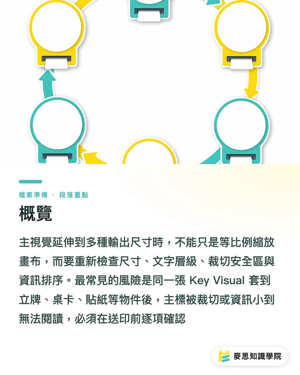
Why Can't One Key Visual Simply Be Scaled Proportionally?
A key visual refers to the main visual system used for one event or one marketing campaign. It usually includes the main image, headline, Logo, event information, CTA, and brand colors. When it is extended to different sizes, it has to keep a consistent identity while also adjusting the layout for each output's viewing distance and trimming method
Proportional scaling looks like it saves time. In practice, it is the easiest way to turn one mistake into a full batch of material problems
An A4 DM is 210 × 297 mm. A table tent may have only half the visual area of an A4 sheet, while an entrance standee can often be over 150 cm tall. The same type size may read well on a DM, blur into a block on a sticker, and feel empty on a standee
I usually divide multi-size extensions into 3 reading scenarios first
・Close-range reading: DM, table tents, packaging cards. The priority is clear small text, complete information, and an orderly hierarchy
・Mid-range recognition: posters and in-store notices. The priority is making sure the main headline, date, and event name are seen first
・Long-range attraction: standees and exhibition backdrops. The priority is the main visual and a one-sentence selling point. This is not where you cram in details
Procurement should ask the designer one question at the start: is this size meant to be held in someone's hand, viewed on a wall, or noticed while someone passes by from a distance
That question is far more useful than "please make it vertical"
How Should Text Be Rebuilt When Layout Ratios Change?
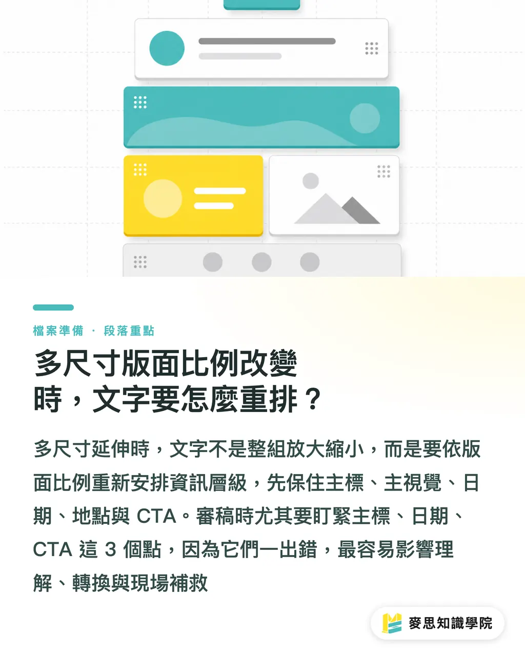
Once the layout ratio changes, the text hierarchy has to be rebuilt. You do not group the original artwork and scale it up or down
When the same key visual is extended from an A4 vertical DM to a 1:1 social graphic, the first things to break are usually the top and bottom margins and the CTA position. When a vertical poster is changed into a horizontal table tent, the main headline is often forced into awkward line breaks, while the subheadline and date get squeezed together
I ask designers to divide the information into 4 levels first
・Level 1: event name, main headline, and main visual. Without these, viewers cannot understand what the graphic is about
・Level 2: date, location, offer, or registration conditions. These are the details procurement and sales care about most for accuracy
・Level 3: CTA, QR Code, phone number, and website. These affect conversion and on-site traffic flow
・Level 4: supplementary notes, fine print, and partner organizations. Necessary, but they cannot take over the layout
For table tents, Level 1 and Level 2 should remain. Level 4 often needs to move to the back or become a separate small card. For stickers, usually only the Logo, main headline, or one short event line should stay. For standees, do not place the QR Code too low. Once exhibition traffic blocks the lower half, the code stops doing its job
During file review, MINDS Printing (MS) pays special attention to three points: main headline, date, and CTA. If any of these three are wrong, they are the hardest to fix on-site at the event
How Much Trim Safety Margin Do You Need to Avoid Problems?
A trim safe area is the protective space reserved in final artwork for trimming, mounting, scoring, and assembly tolerances. Text, Logo, QR Code, and key imagery should not sit too close to the edge, so a 1 to 2 mm trimming shift does not cut into important content
For small paper items, you need at least bleed and a safe margin. A common setup is adding 3 mm bleed on all four sides, then moving important text further inward. For large-format prints, standees, and display items, you cannot look only at 3 mm, because board mounting, trimming, structural fixing, and on-site installation all add variables
When extending across multiple sizes, the trim safe area has to change with the item's use
・DM: 3 mm bleed on all sides is common, and text should not sit near the trim line
・Table tent: fold lines, score lines, and the standing angle will eat into the visual area. Do not place the Logo directly on top of a fold line
・Sticker: if there is a die line, text needs to stay farther away from the cut line. Rounded corners and custom-shaped stickers are especially easy to make look off-center
・Standee: the bottom is often blocked by the stand, floor reflection, or crowds. Do not press key information against the lowest edge
・Social graphic: platform previews crop thumbnails, so do not place must-read text around the edges
I have seen plenty of cases where the artwork looks beautiful on screen, but every print problem appears at the boundary: text too close to the edge, Logo too close to the edge, QR Code too close to the edge
If the boundary is not reserved, the printer cannot save it
How Should Images Be Extended When They Are Not Wide or Tall Enough?
Image extension starts by separating the subject from the background. You cannot force-stretch the subject. The background is where extension may work
For example, suppose an event's main image is originally a vertical portrait and needs to be extended into a horizontal table tent. If you simply stretch the person wider, the face shape and product proportions will distort. A steadier method is to keep the person's proportions fixed, extend the background to the left and right, bridge the layout with color blocks or brand patterns, and replace the image with one better suited to a horizontal format when needed
I usually ask designers to prepare 3 types of key visual assets
・Original main image file: keep the highest resolution for posters, standees, and large-format output
・Cut-out subject: separate the person, product, or main object so it can be rearranged across different ratios
・Extendable background: solid color, gradient, scene extension, or brand Pattern used to fill horizontal and vertical ratio gaps
If you need to produce 6 sizes, poster, DM, standee, table tent, sticker, and social graphic, it is best to avoid a composition where every important element is packed against the four edges from the very first key visual draft
Designers can use AI to help organize copy hierarchy and generate layout drafts in different formats, but final artwork judgment still has to return to what happens in print production: whether the resolution is high enough, whether the subject is distorted, and whether the brand is still recognizable after trimming
How Should Procurement Build a Size Table and Output Naming Rules?
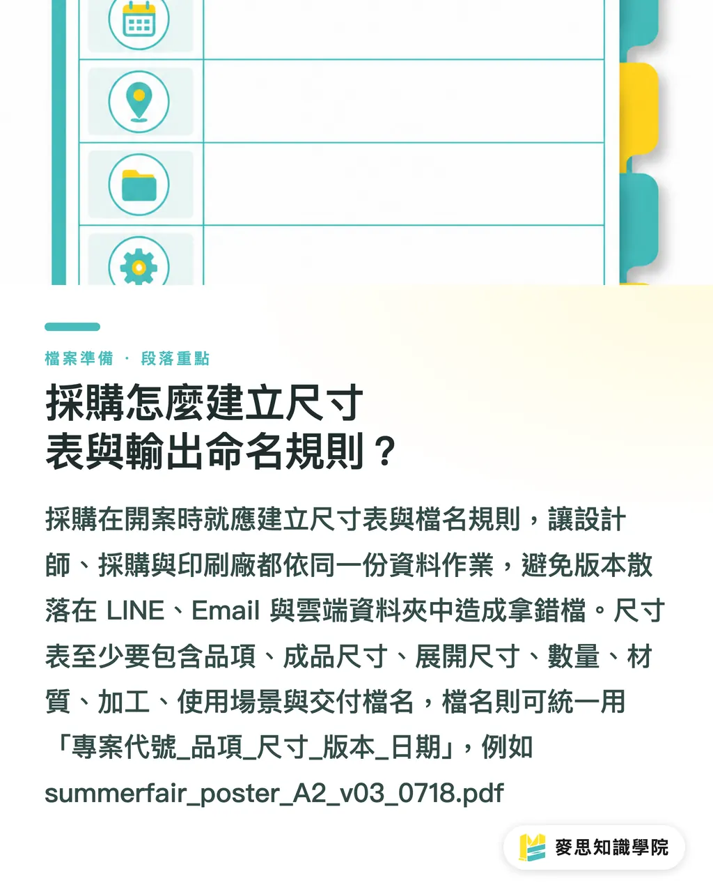
The size table should give designers, procurement, and the print vendor the same answer. It should include at least 8 fields: item, finished size, flat size, quantity, material, finishing, usage scenario, and delivery filename
The common mess in corporate event materials is usually not that the designer cannot do the work. It is that versions grow separately across LINE, Email, and cloud folders
Procurement should create a size table at project kickoff
・Poster: finished size, vertical or horizontal orientation, posting location, and whether lamination or specialty paper is needed
・DM: A4, A5, or another size, single-sided or double-sided, and whether fold lines are needed
・Standee: finished height, base type, whether it is board-mounted, and whether on-site installation is needed
・Table tent: flat size, fold line positions, standing method, and front/back information
・Sticker: size, die-cut shape, material, and whether film lamination is needed
・Social graphic: 1 1, 4: 5, 9:16, or another ratio, and whether a thumbnail safe area is needed
Filenames also need rules. Otherwise, procurement will definitely pick up the wrong file near the end of approval
My usual naming format is "project code_item_size_version_date", for example "summerfair_poster_A2_v03_0718.pdf"
MINDS Printing is suitable for custom commercial printing projects that need discussion around materials, finishing, and multi-size integration. Mai Printing is suitable for common printed items with clear specs, fixed sizes, and online ordering needs
If procurement is still in the planning stage, they can also ask the Mai Strategy Knowledge Academy consulting team to help organize the size table and print submission checklist first. This step is usually cheaper than making 3 rounds of major revisions later
Key Takeaways
・When extending one key visual across multiple sizes, rebuild the information first, then adjust the size
・Use viewing distance to decide type size, use purpose to decide content, and use finishing to decide the safe area
・Posters, DM, standees, table tents, stickers, and social graphics cannot share one trimming logic
・The size table is procurement's version-control tool, and filename rules are the safeguard against sending the wrong file
・Prepare the main image, cut-out subject, and extendable background separately, and multi-size output will need far fewer revision rounds
Further Thinking
Extending one key visual across multiple sizes is front-end specification management for print manufacturing, layout system capability for design, and, for SaaS and AI applications, a trackable process built around "size table, text hierarchy, output naming, and review status." The next step can be to list the 6 to 10 event materials your company makes most often as fixed templates, so every project starts from size, material, use case, and version number instead of guessing from a beautiful key visual
FAQ
- Can the same key visual be scaled up and down directly for different sizes?
- Not recommended. Posters, DM, standees, table tents, stickers, and social graphics differ in viewing distance, ratio, and trimming method. Final artwork needs a rebuilt text hierarchy, safe areas, and confirmation that the image can be extended
- What should be confirmed first when extending a design across multiple sizes?
- Confirm the size table first. At minimum, it should clearly list the item, finished size, quantity, material, finishing, usage scenario, and filename, so procurement and the designer work from the same specs
- What is the difference between trim safety margin and bleed?
- Bleed extends the background beyond the trim line to avoid white edges after cutting. The safe area moves text, Logo, and QR Code inward to prevent trimming or finishing tolerances from cutting into key content
- How do layout priorities differ between a standee and a DM?
- A DM is read up close, so the information can be complete but must be clearly layered. A standee is usually recognized from mid to long range, so the main headline, main image, and date need to be seen first, with fewer details crowded in
- How can procurement avoid picking the wrong file among many versions?
- Use fixed naming rules to manage files, such as "project code_item_size_version_date." Update the version number every time the artwork changes, and have procurement confirm each item against the size table
Related articles


The Print × AI weekly
The print and AI know-how designers, brands and enterprises can use before they commit — one email, every week
MINDS Free Tools
AI background removal, a LINE sticker maker, spine & imposition calculators — all free, right in your browser, no upload.
MINDS Group
Need actual printing or gifting services?
From premium printing to online ordering and festive gifts — the MINDS Group sister brands take it from here.