
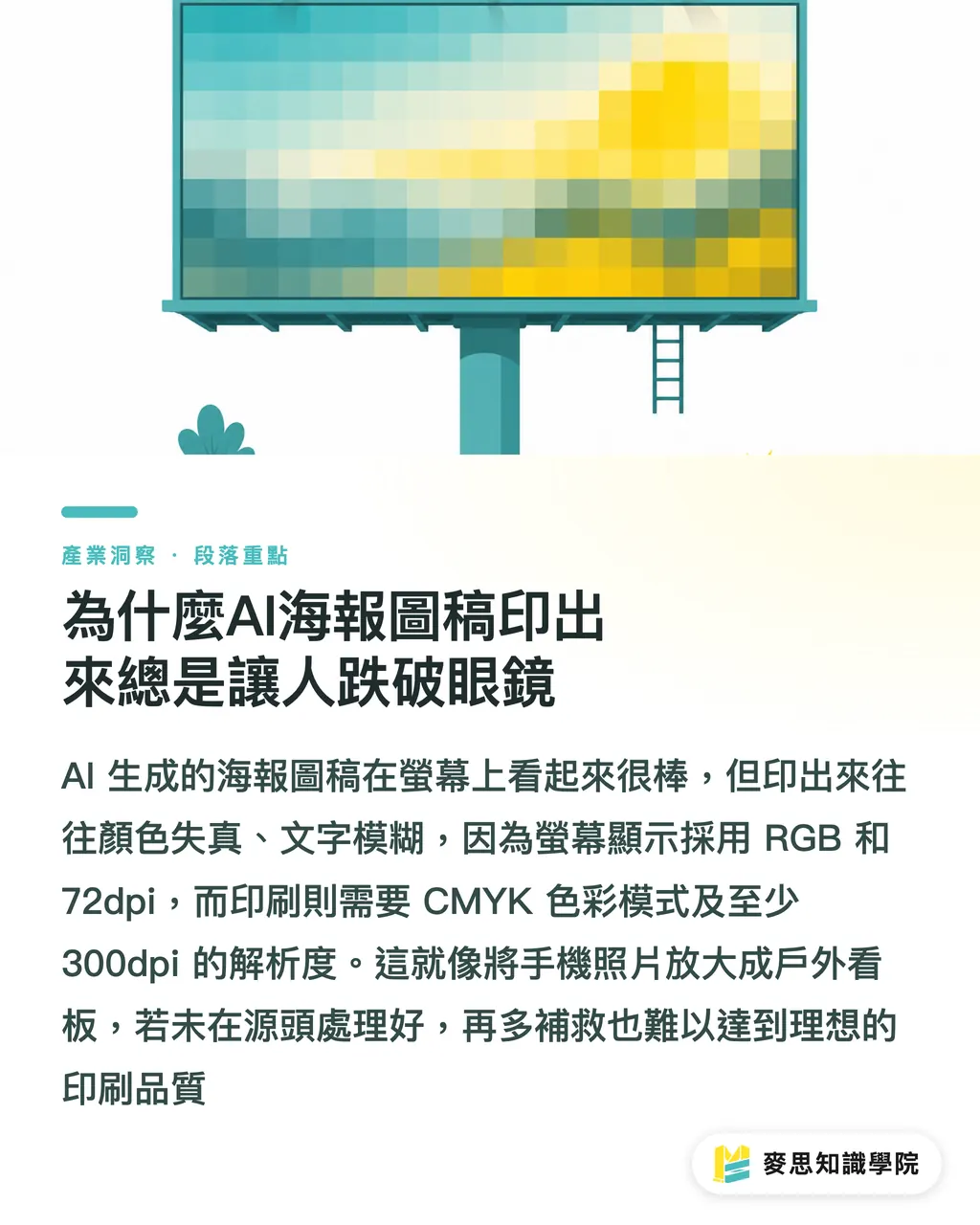
Why AI Poster Artwork Often Disappoints When Printed
Based on my experience handling thousands of printing projects, in the last six months, many clients have brought me 'beautiful' AI-generated posters, asking, 'Why are the colors completely wrong and the text so blurry when printed?'
This happens 99% of the time. The issue is simple: the artwork we see on computer screens is mostly in RGB color mode with a 72dpi screen resolution, intended only for looking 'good' and quick viewing. Printing is a completely different world; it requires CMYK color mode, at least 300dpi resolution, and precision in every single detail
It's like enlarging a photo taken on your phone directly into an outdoor billboard; the result will inevitably be blurry and grainy. There is a deep divide between 'on-screen visuals' and 'physical printing' for AI artwork. If this gap isn't addressed at the source, no amount of later fixes will achieve the desired print quality
How to Craft Prompts for AI Image Generation That Are 'Print-Ready'
Solving problems at the source is the most cost-effective and efficient approach. My advice is to 'sow the seeds of printing' directly when entering prompts for AI
This means incorporating the 'hard specifications' required for printing into your prompts:
・Resolution and Dimensions: Specify high resolution clearly. For example, try adding '300 DPI', 'high resolution for print', or even 'vector art'. If your final poster size is A3, don't hesitate to include 'A3 size poster, 300dpi' in the prompt
・Color Mode: Although most AI generation tools default to RGB, you can try guiding it toward print-suitable color concepts in your prompt, such as 'CMYK color mode' or 'for offset printing'. While not guaranteed to be strictly followed, it increases the probability of it leaning toward the print color gamut
・Detail Description: For text or graphical details, use terms like 'crisp lines', 'sharp details', and 'smooth gradients' to ensure the AI considers line clarity and smooth color transitions during generation
Intervening early and making the AI think towards printing from the start saves a huge amount of subsequent adjustment work. You can even include print terminology like 'bleed' in your prompt; while AI's current understanding is limited, the trend is that it will only get smarter
Locking Down Brand Colors: Practical Color Management for AI Artwork
Many designers complain to me that the colors in AI-generated artwork are always 'close but not quite' the brand color, especially for logos or key visuals. This is a major issue for brand identity, particularly in printing, where even slight color shifts can severely diminish brand image
To resolve this pain point, we need to introduce a color management workflow:
・Prompt Precision: Beyond describing colors, provide precise color values directly in your prompts. For example, if your brand color is Pantone 185 C, try including 'Pantone 185 C red' or 'CMYK (0, 100, 100, 0)' in the prompt. Some AI tools are starting to support this kind of precise color code input, which works much better than simply describing it as 'bright red'
・Calibration and Comparison: After generating artwork, be sure to review it on a calibrated monitor. The best practice is to perform a 'physical proof'. Digital proofs may give you a rough idea, but only by creating a physical proof on the actual paper stock can you truly see how brand colors perform in print. Proofing is like a mock exam before the final; it helps you catch all potential color issues
・ICC Profile Application: Import the ICC profile used by your printing house into your design software so that the colors you see on screen are closer to the final printed result. This is a professional color calibration step; while it sounds complex, it is key to ensuring color accuracy
In my experience, color management is a systematic endeavor. From the initial AI prompt to the final physical proof, every step must be handled with care. Especially for brand colors, you absolutely must verify them personally
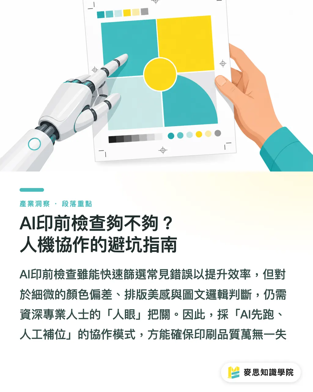
Is AI Prepress Check Sufficient? A Guide to Human-AI Collaborative Pitfall Avoidance
AI is indeed fast at prepress checks. It can quickly scan files and identify many common errors, such as insufficient bleed, fonts not outlined, low-resolution images, and incorrect color modes—tasks that used to be time-consuming and labor-intensive for humans
But don't assume that with AI, we can completely let go. Based on my many years of experience in printing, some 'fatal issues' can only be detected by the human eye. For example:
・Subtle Color Deviations: AI might judge a certain color value as correct, but in actual visual terms, this tiny color difference could make the designer or brand owner feel unsatisfied
・The 'Rationality' of Typesetting Errors: AI might be able to catch text overflowing a frame, but it struggles to judge whether a seemingly error-free layout is unappealing due to poor kerning, line spacing, or paragraph breaks, thus failing to meet design aesthetics
・Logical Consistency of Content: AI can detect low-resolution images, but it cannot determine whether the image content matches the text description, if copyright issues exist, or even if an image is politically incorrect
Therefore, I have always advocated for an 'AI first, human backup' check process. Let AI handle the basic and repetitive error screening to significantly boost efficiency. However, checks requiring 'judgment', 'aesthetic sensibility', and 'logic' must ultimately be supervised by experienced printing professionals or designers. Communication and prepress file checks take up nearly half of my daily work; ensuring file quality is synonymous with ensuring printing does not go awry
Key Takeaways
Don't let on-screen illusions ruin your printed results; high resolution and CMYK are fundamental
Precise prompts are the starting point for print quality; incorporate print specifications early
Color management is the lifeline of brand identity; physical proofing is a must
AI is a great prepress assistant, but human review is necessary to avoid fatal errors
Consider printing at every step, from prompt to finished product, to perfectly translate your creativity into physical form
Extended Thinking
For print manufacturers, designers, and AI application practitioners, AI-generated imagery is undoubtedly a powerful tool for boosting efficiency. However, the real challenge lies in how to smoothly translate these creative works into high-quality physical prints. My advice is to integrate a 'printing mindset' into the design process as early as possible, especially starting from AI prompts. This is not just a technical issue, but a paradigm shift—viewing AI as a professional assistant that requires 'training' and 'guidance', rather than a panacea. At the same time, designers and printing houses need to continuously learn about the latest AI advancements and incorporate them into existing color management and prepress check workflows. Achieving this level of human-machine collaboration is essential to maintaining competitiveness in this new era and providing truly 'one-stop', high-quality services
FAQ
- What are the problems with printing AI-generated artwork directly?
- The most common issues are insufficient resolution, incorrect color modes (RGB to CMYK conversion causing color shifts), and mismatched dimensions, leading to blurry results, heavy grain, or distorted colors
- How to specify high resolution for print in a prompt?
- You can explicitly add '300 DPI', 'high resolution for print', or specific dimensions like 'A3 poster, 300dpi' to your prompts, and even try using 'vector art'
- How to ensure brand colors are correct in AI-generated images?
- Try to provide precise brand color codes (such as Pantone or CMYK values) in the prompt, and pair this with a calibrated monitor and physical proofs to verify print colors
- Can AI prepress checking completely replace humans?
- AI can quickly identify conventional errors, but for complex design details, subtle color deviations, or overall visual judgment, human review is still indispensable. I recommend an 'AI first, human backup' approach
- Why do colors look great on screen but differ significantly when printed?
- Screens use the RGB color mode to display light, while printing uses the CMYK mode, presenting colors through ink layering. The principles and color gamuts differ, easily leading to a visual discrepancy