
Overview
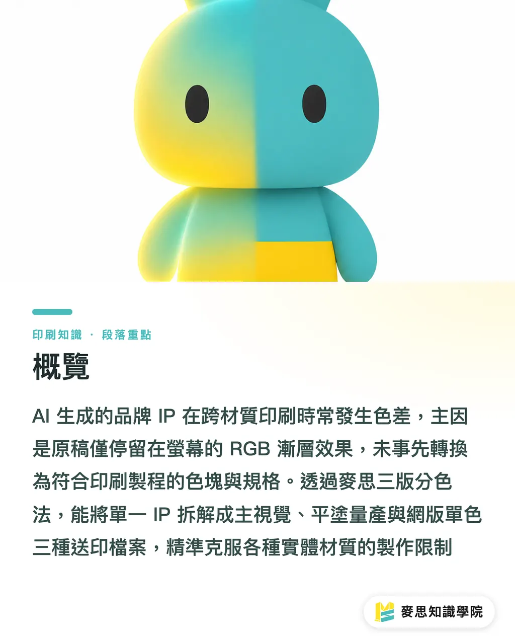
When an AI-generated brand IP looks different across materials, the printer is rarely the first place to point fingers. The real culprit, the one that comes up most often on the production floor, is a source file stuck in RGB gradients and screen effects, never converted into the color blocks, line weights, and approval specs that a print process can reproduce consistently
MINDS (MS, mid-to-high-end fully custom commercial printing) uses a three-plate separation method that splits one IP into three production-ready files:
・ Hero color plate: keeps the primary colors and essential depth closest to the brand's identity
・ Flat-color production plate: strips out fragmented gradients and replaces them with a small number of controllable color blocks
・ Screen print and single-color restricted plate: a thick-line, white-space, low-color-count version for canvas bags, boxes, and promotional items
Why Do AI-Generated Brand IPs Shift Color After Printing?
Over the past year I've seen the same thing play out on both the design side and the print side: a company generates a mascot with AI, then drops that character onto business cards, stickers, corrugated boxes, and canvas bags. One character on screen, four personalities once it hits the print floor
The trouble usually starts with the file. AI images typically carry RGB, transparency, drop shadows, hair-thin lines, and multi-layer gradients, and these effects don't speak the same language across offset, flexo, and screen printing
・ RGB mixes red, green, and blue light to produce color on screens. It works fine for display preview, but needs to be converted to CMYK or spot colors before going to print
・ CMYK prints by layering cyan, magenta, yellow, and black inks, and the final color is shaped by the paper stock, ink, press, and ICC Profile
A business card's coated stock reflects light strongly. A corrugated box soaks up ink. A canvas bag has a fibrous surface. The same orange placed on all three will shift in brightness, saturation, and edge crispness
The single biggest mistake on the print floor is treating what looks good on screen as the production standard. Screens emit light. Paper doesn't. I've said that to clients more times than I can count, because it genuinely determines whether anyone wastes their time
What Is Print Dimensionality Reduction?
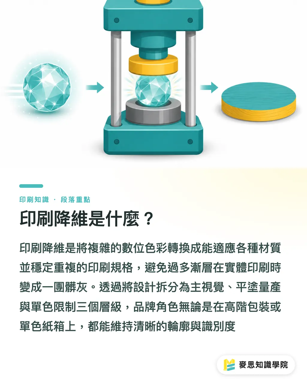
Print dimensionality reduction means converting RGB, transparency, thin lines, and gradients into color blocks, line weights, plate variants, Profiles, and acceptance criteria that a print process can reproduce consistently
When handling an AI brand IP with MINDS's (MS) three-plate separation method, I split the character into three tiers instead of handing the original to every printer and hoping for the best
・ Hero color plate: used for websites, catalog covers, and premium packaging. Preserves the character's expression, primary colors, shadow depth, and brand identity
・ Flat-color production plate: used for business cards, stickers, outer boxes, and inserts. Soft haze gradients replaced with 2 to 4 stable color blocks
・ Single-color restricted plate: used for boxes, screen-printed bags, foil stamping, and embossing. The character simplified to a version where the silhouette still reads in one color
・ ICC Profile is a settings file that describes how a device or material renders color. It gives the design, proofing, and print sides a shared reference point for the same color
・ Delta E is a numerical measure of the color distance between a proof and a standard. The smaller the number, the closer the match. Acceptable tolerances are negotiated based on brand requirements and material
For some AI IPs, the real problem isn't too few colors, it's too many. A character with 20 layers of soft light on its face becomes a muddy grey patch on a box, then a shapeless shadow on a canvas bag
What Files Do You Need for Different Materials?
Cross-material printing starts with a dedicated file for each substrate. MINDS's (MS) three-plate separation method checks at least three common carriers: paper, corrugated board, and fabric
・ Business cards and catalogs: offset or digital printing can handle finer detail, but color still needs to be managed with CMYK, Pantone, and ICC Profile. Don't rely on RGB transparency for the character's eyes, fine lines, or shadows
・ Corrugated boxes: flexo frequently runs into ink absorption and dot gain on the board surface. Convert the IP artwork to 1 to 3 flat colors, replace large-area shadows with solid blocks, and give black lines a wider safety margin
・ Canvas bags and promotional items: screen printing works for thick lines and flat color. Fine gradients and semi-transparent lighting effects need to be converted to halftone dots, stepped tones, or removed entirely. Fewer colors means fewer registration problems
Line weight standardization also belongs in the file spec. Character outlines, eyes, mouth corners, and fingers, any detail thinner than 0.25 mm shouldn't go straight into mass production artwork without the print side confirming they can hold it
If the same IP is going on three or more substrates, I'd recommend running it through a Mai Strategy Knowledge Academy consulting session first to get the brand colors, line weights, file naming, and approval samples all written down at once
Why Does Screen Printing Often Ruin AI Gradients?
Screen printing pushes ink through a mesh onto the substrate using a squeegee. Its strengths are dense color blocks, direct color, and broad material compatibility. Its weakness is that subtle RGB soft-haze gradients are hard to reproduce consistently
Screen printing can do halftone tonal gradations, but the pixel-by-pixel soft haze typical of AI images turns coarse, muddy, and banded in production runs, especially on canvas bags, rough-textured paper, and uneven promotional surfaces
I break the screen-printing file into three tonal tiers:
・ Dark shadow: one solid dark color to define the character's silhouette. No transparency stacking for the darks
・ Mid-tone primary: the brand's main color carries the recognition. No chasing a screen-accurate feel with every ink batch
・ Highlight as empty space: let the material's own white or light color serve as the highlight, which cuts registration shift risk
Line artwork needs to be consolidated too. The same character shouldn't carry all of these at once 0.1 mm, 0.3 mm, 0.8 mm, all three weights mixed arbitrarily. Outer outlines, facial features, and decorative lines should be organized into fixed size grades so the plate maker knows which ones are non-negotiable
When a single IP needs to cover canvas bags, stickers, and boxes at the same time, I have MINDS check the material and ink constraints first, then decide how many colors the screen-print file should keep. That's far less work than trying to fix color drift after the fact
How Can Companies Turn an AI IP Into a Long-Term Print Specification?
When a company adopts an AI IP, the first real task is turning the character from 'a nice-looking image' into a handoff-ready procurement spec. That spec needs to be readable by at least three parties: the designer, the buyer, and the printer
For the minimum deliverable under MINDS's (MS) three-plate separation method, I require one approved color proof, three vector or high-resolution master files, and one page of print specifications
・ One approved color proof: a physical sample that confirms the brand's primary and secondary colors, black line density, and how the paper stock reads
・ Three master files: hero color plate, flat-color production plate, and screen print / single-color restricted plate, each named separately
・ One page of print specs: CMYK values, Pantone codes, ICC Profile, minimum line weight, bleed, material constraints, and acceptable color tolerance, all written out
Don't underestimate file naming. I've seen too many projects grind to a halt between final, final2, and final-new. Long-term IP procurement needs version control: names like mascot-v01-offset, mascot-v01-screen-1c, mascot-v01-box-flexo
Before using an AI IP across packaging, business cards, boxes, and canvas bags, run one round of proofing and spec confirmation. Every reorder, every supplier change, every substrate swap after that can come back to the same standard, instead of guessing colors from scratch each time

Key Takeaways
・ AI-generated IPs need dimensionality reduction before printing. Send RGB gradients straight to press and they'll go their own way on boxes, canvas, and cards
・ Cross-material consistency depends on three files: the hero color plate, the flat-color production plate, and the screen print / single-color restricted plate
・ Screen printing can produce a distinctive IP, as long as the lines are thick enough, the color blocks are clean, and the gradients have been converted into plateable tonal steps
・ Proofing means converting 'does it look good' into the approval language of Pantone, CMYK, ICC Profile, Delta E, and material constraints
Further Thoughts
For print manufacturers, AI IP means more small-batch, high-variety orders, which means getting material constraints on the table early. For designers, the skill that matters is shifting from 'can draw characters' to 'can organize print specs.' For AI adoption and SaaS teams, the most valuable feature isn't generating another 100 character illustrations. It's taking one high-use IP and packaging it into three master files, one color proof, and one procurement note, so the next time a company orders business cards, boxes, or canvas bags, nobody has to start the conversation over
FAQ
- Can an AI-generated mascot go straight to print for business cards?
- You can run a test, but before sending to production, convert the RGB file to CMYK or spot color specs and check line weights, transparency, resolution, and bleed. A business card's small format will expose thin-line and color-shift problems fast
- Why does the same IP look so different on a corrugated box versus a canvas bag?
- Corrugated board, canvas, and coated paper absorb ink differently, have different surface textures, and different white points. Offset, flexo, and screen printing each change how color reads too. Managing the same brand color across all of them requires approved samples and defined tolerances
- Can screen printing handle the gradients in an AI image?
- Screen printing can do halftone gradations, but it's not suited for fine RGB soft-haze gradients straight from an AI output. Production files should be converted to flat color blocks, stepped shadows, or a single-color version
- What's the minimum number of files needed for a cross-material brand IP?
- Three, at minimum: the hero color plate, the flat-color production plate, and the screen print / single-color restricted plate. Pair those with one approved color proof and one page of print specs
- What should a designer check before handing an AI IP to a printer?
- Check CMYK or Pantone specifications, ICC Profile, minimum line weight, transparency effects, bleed, vector outlines, and the material-specific version. Get all seven clearly written down and the printer has something to work from consistently
Related articles




The Print × AI weekly
The print and AI know-how designers, brands and enterprises can use before they commit — one email, every week
MINDS Free Tools
AI background removal, brand stamping, and a LINE sticker maker — free design tools, right in your browser, no upload.
MINDS Group
Need actual printing or gifting services?
From premium printing to online ordering and festive gifts — the MINDS Group sister brands take it from here.