
COMPLETE GUIDE
印刷设计完整指南:从字体、配色到完稿交接,设计稿印出来才算数
屏幕上再漂亮的设计,印坏了就是废纸。印刷设计和纯数字设计是两套思维:色彩空间不同、分辨率门槛不同,连字体授权的坑都不同。这份指南把印刷品设计从规格框架、字体配色一路讲到完稿交接与打样验收,让设计师 the 每一稿都经得起上机
规格先行:尺寸、印量与预算决定设计自由度
动笔前先把三件事定死:成品尺寸与折法、预估印量、加工预算。尺寸决定版面骨架与出血规划;印量决定走数码还是胶印,直接影响色彩策略;预算决定你能不能玩烫金、击凸这些加分项
顺序反过来就是灾难:设计完才发现尺寸要迁就合版菜单、专色只能改印四色、预算塞不下模切。规格框架是设计地基,而不是交稿前的检查项
DEEP DIVE传单设计 6 步完整流程字体:选用、搭配与授权三关
印刷字体学的重点在成品:正文字号低于 6pt 就是可读性赌博、细衬线在反白时容易断笔画、屏幕上刚好的行距印出来常嫌挤。搭配上遵守「一显一正」原则——标题有个性、正文求安定,两套字族就足够
授权是设计师最常踩的雷:个人授权不等于商用、嵌入 PDF 和转曲在授权条款里可能是两码事。交稿前确认每套字体的商用授权范围,拿不准就转曲并保留源文件
DEEP DIVE印刷字体学:从字号、行间距到反白,避开屏幕与成品的视觉陷阱色彩:用 CMYK 思维设计,别让屏幕骗你
屏幕是 RGB 加色、印刷是 CMYK 减色,色域天生不对等——荧光感的亮绿亮蓝印出来一定发闷。设计初期就把文件建立在 CMYK,或至少用色彩打样校正预期,别等输出才发现整组品牌色走样
品牌色要跨批次一致,就得定义印刷端的色彩规格:涂布纸与非涂布纸各配一组 CMYK 值或指定专色,重要项目上机前打数码样。品牌色系统做得好,换纸换厂都站得住脚
DEEP DIVEAI 生图颜色跑偏?锁定品牌色的印刷色彩管理实战版面:网格、留白与信息层级
印刷版面是一次定生死的静态媒介,没有滚动也没有 hover——信息层级要在一眼之内成立。用网格建立节奏,靠字号对比与留白划分主次,让读者的视线有明确的行进路线
留白不是浪费纸,是高级感的原料。塞得满满当当的版面在屏幕上或许还行,印成实体只会显得廉价;重要信息周围留出呼吸空间,比放大字号更有效
DEEP DIVEAI 设计简报转版面规划:让设计师少改三轮的前置工法材质与工艺:把纸张和工艺当作设计元素
纸张的白度、涂布与手感会改写你的色彩和质感:同一个设计印在铜版纸和特种纸上是两个作品。选纸不是印刷厂的事,是设计决策的一部分——设计时就要想着它会落在哪种纸上
烫金、击凸、局部UV这些工艺是「少而准」的游戏:挑一个视觉焦点做足,比四处点缀更有张力。记得工艺需要另外制版,设计稿就得把工艺范围拆成独立图层标清楚
DEEP DIVE局部UV高级感备稿术完稿与交接:出血、转曲与文件防错
完稿是设计师的职业信用:出血补满、安全区域内缩、图像确认有效分辨率、字体转曲或确认嵌入、链接图打包。这五件事任何一件漏掉,都可能让前面所有心血打折
交接文件要让印刷厂「不用猜」:输出印刷用 PDF 而非工作源文件、附上规格说明(尺寸、纸材、工艺、色彩要求)、特殊工艺附示意图。沟通成本省下来的,都会变成成品质量
DEEP DIVE设计交稿防甩锅!字体侵权雷区与转外框打包完整流程打样与验收:让成品对得起设计稿
打样是设计师唯一的后悔药:数码样看色彩倾向、实纸样看纸张质感与工艺效果。重要项目别省打样费——重印的成本永远比打样贵,而且赔上的是交期和信任
验样看什么:品牌色准不准、细字有没有糊、工艺位置对不对、裁切会不会切到重要元素。确认无误再签样上机,之后的色差争议才有依据可讲
DEEP DIVE特殊工艺打样看什么?烫金击凸与模切避坑指南相关文章
Logo 设计费用怎么估?设计师 vs 设计公司报价结构解析
Logo 设计费用主要买的是三件事:品牌识别的策略判断、视觉符号的原创构思,以及未来几年的长期使用权益。麦思印刷(MS)常被客户问“为什么一个 Logo 要好几万”,原因就在这里,便宜的设计师可能只是把图库素材拿来改一改、修一修,交个 vector 文件就算结案;正规流程除了画面,还包含市场定位、竞品分析、字体授权、图稿延展、商标注册评估
AI 设计简报转版面规划:让设计师少改三轮的前置工法
把业务简报或产品资料直接交给设计师,几乎是每次设计大改的起点。这篇文章说明如何在排版之前多加一个步骤,用 AI 把文字素材整理成版面信息架构,让主标、卖点、CTA 在设计启动前就先确认好顺序,从根源减少反复重改的成本

AI 如何助力 Logo 设计?生成的图片能直接使用吗?
许多设计师希望借助 AI 加速 Logo 设计构思,却受困于分辨率不足和版权疑虑。本文为您解析 AI 在 Logo 设计前中期的实用场景,并指出在定稿送印前必须跨越的技术门槛

名片设计费用怎么算
名片设计费用主要在算版面排版、印前检查与输出责任,Logo 设计费用则是在算品牌识别、策略判断与长期使用权益 两者价差大很正常,因为名片是把品牌放进 90 × 54 mm 的实体媒介,Logo 是决定品牌往后几年怎么被识别
AI 配字体指南:印刷顾问教你告别凭感觉的字体搭配术
字体选择一直是平面设计中最耗时、最容易陷入选择障碍的环节。 这篇文章我将从十多年的印刷实务出发,带你把字体搭配的专业直觉转化为 AI 可执行的系统化流程。 从 AI 工具推荐、中文字体特殊考量到印前输出检查,确保你的设计不仅在屏幕上好看,印出来更是精准到位
设计交稿防甩锅!字体侵权雷区与转外框打包完整流程
云端字体订阅普及后,设计师交稿时的字体风险反而更复杂了,断线掉字是一种、商业授权不足是另一种,两种都能让你出事后无话可说。这篇从实际印刷现场的交稿流程出发,把字体检查、转外框、打包到 PDF 输出的 SOP 一次讲清楚
印刷字体学:从字号、行间距到反白,避开屏幕与成品的视觉陷阱
屏幕上看起来再完美的设计,一旦用错字号、设错行间距,印刷出来就是一场灾难。从我十多年的印刷实务经验出发,这篇文章直接给你字体设置的几条关键安全线,确保你的设计能完美落地,避免花冤枉钱重印
字体没嵌好,整本手册变豆腐块的预防实战
我在印刷厂车间见过太多这种翻车案例:设计师信心满满地把 PDF 发过来,机器一开、样张一出,整排文字变成方块,整段英文变成□□□□
如何设计印刷日历?资深顾问的排版与纸张实战指南
每年六月是企业筹备来年年历的关键期 这篇文章从物理规格、纸张雷区到 AI 辅助流程,拆解如何避开实操盲点,产出一份既好看又好写的高品质专业日历

传单设计 6 步完整流程
传单设计要先决定读者看到信息的顺序,再处理版面、色彩、图片与行动呼吁,最后回到印刷规格检查 这篇用麦思印刷(MS)传单六步法,把 A4、A5、出血、CMYK、CTA 与送印检查一次讲清楚
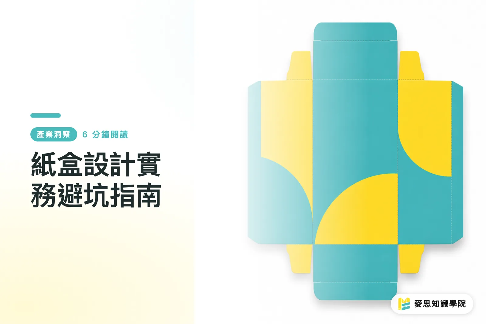
纸盒设计实务避坑指南
纸盒设计要先规划刀模与折叠方向,再做版面与视觉配置;麦思印刷(MS)送印三道关会先看结构、再看印刷、最后看折好后的正面效果 这篇文章用印刷现场的做法,把刀模规划、排版逻辑、折叠视觉平衡一次讲清楚,让设计稿更接近真正成品

设计师必学:AI工具如何加速印刷品设计流程?
身为资深印刷顾问,我看到AI工具如何实质提升设计效率,并优化从创意到印刷的每一个环节,让设计师更能专注核心价值。这篇文章将分享我的观察与实战建议
More topics
Other complete guides
您的印刷 × AI 行业顾问
不只是印刷厂——我们作为行业顾问,帮助品牌与企业将印刷制造与 AI 相结合:从印前处理、纸张与印后工艺选择到成本优化,以及将 AI 引入设计与印刷工作流、自动化与数字化转型
预约免费咨询