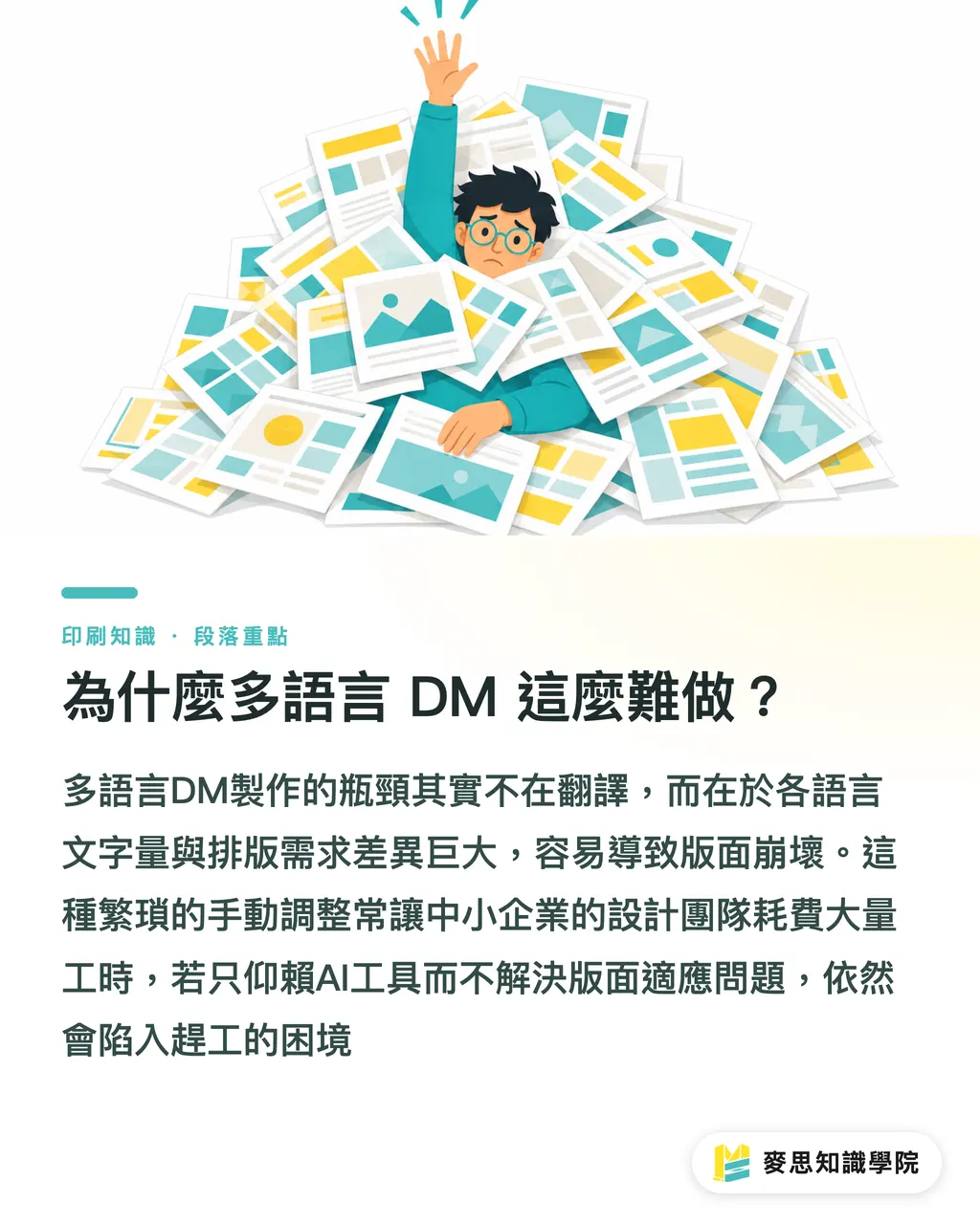
Why is producing multi-language DMs so difficult?
・When Taiwanese manufacturers participate in exhibitions, DMs usually need to be prepared in three sets: Chinese, English, and Japanese. It sounds like just translating three times, but the real trouble on-site isn't the translation; it's the layout
・The traditional approach is: the designer finishes the Chinese version, copies out the text, gives it to a translator or Google Translate, and pastes the translation back into the layout upon receipt. The problem is that every language has different word counts, font size requirements, and line spacing habits; once pasted in, the layout becomes a mess, and then manual compression column by column begins. After finishing three versions, working hours can easily be eaten up by two or three days
・I have worked with many small and medium-sized export enterprises where the design team consists of only one or two people. The pressure to rush out a tri-language DM two weeks before an exhibition is considerable. The advancements in AI translation tools over the past two years have indeed made this path feasible, but if used incorrectly, the problem just shifts from 'translation bottleneck' to 'layout explosion'
The English version blows up the layout most often—remember this number
・The character count of English sentences is usually 30% to 40% longer than the corresponding Chinese. This isn't a rough estimate; it's a reality encountered every time you switch languages on the print floor
・For example, '高效能精密研磨機' (seven characters) translates to 'High-Performance Precision Grinding Machine'; just counting letters and spaces, it exceeds 40 characters—the visual length is almost double that of the Chinese. Replacing the entire DM copy with English causes every text box that was perfectly laid out to start overflowing
・There are several ways to handle this:
・Leave breathing room at the design source: Don't layout the Chinese text boxes perfectly tight; intentionally leave 20-30% margin so the English version has space
・Use a slightly smaller English font: Chinese text is usually set to 9-10pt, while English can be reduced to 8-8.5pt. It remains visually similar while accommodating many more characters
・Control word count: When asking AI for English translations, add a word limit to your prompts (e.g., 'Please keep it under 40 English words'); this is less effort than compressing the layout later
・Pre-set InDesign's GREP styles and paragraph styles to give text boxes an 'auto-shrink' safety mechanism
・AI translation tools (ChatGPT, DeepL, etc.) are currently decent for 'short, precise marketing copy,' but you must actively request brevity, or they will give you a complete, fluent version that won't fit your layout
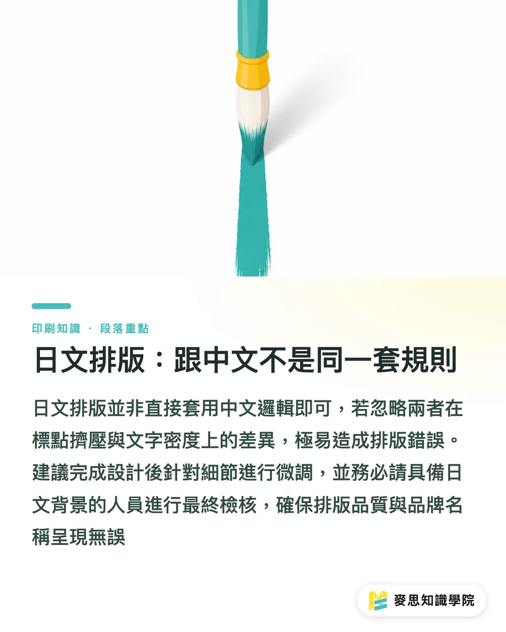
Japanese layout: It follows a different set of rules than Chinese
・Many designers doing their first Japanese DM will use the same method as the Chinese version: swap in a Japanese font, paste the translation, and send to print. That is almost guaranteed to be wrong
・Japanese layout has several habits that aren't encountered in Chinese that you need to be aware of:
・Vertical vs. horizontal habits: Japanese print materials extensively use vertical layout (top-to-bottom, right-to-left), especially for books. DMs are usually horizontal, but if the client is a major Japanese manufacturer, it's best to confirm their preference first
・Punctuation adjustment (Kerning logic): The spacing behavior of full-width Japanese punctuation (「、」「。」「()」) in layout software is different from Chinese. Optical spacing settings for Japanese characters in Illustrator and InDesign must be adjusted separately; you cannot simply continue using Chinese paragraph settings
・Visual rhythm of mixed Kana and Kanji: Japanese copy includes many Hiragana and Katakana, making the visual density of the text lower than in Chinese. If you maintain the same line spacing and letter spacing as the Chinese version, the Japanese version will appear loose and requires fine-tuning
・Katakana for brand names: Foreign brand names are indicated using Katakana in Japanese. AI can usually handle this, but you must manually check it, especially your own brand name; sometimes AI adopts unconventional Katakana spellings
・I usually recommend having someone with a Japanese background review the finalized Japanese version, even if it's just to confirm punctuation and brand names; this step cannot be skipped
What can AI translation do, and what can it not?
・I think it's necessary to be clear on this question, because the boundaries of the tool's capabilities determine where you need to supplement with human labor
・What AI translation does well now:
・General translation of marketing copy such as exhibition themes and product selling points
・Quickly generating a first draft for human review, which is much faster than translating from scratch
・Synonymous rewriting (when the layout is full, ask AI to express the same meaning in shorter sentences)
・Parallel output for multiple versions (giving you side-by-side comparisons of three language versions simultaneously)
・What AI translation cannot be left to handle:
・Technical specification terminology: For precision machining terms like 'Surface Roughness Ra 0.8' or 'Feed Rate,' AI sometimes uses generic translations rather than industry-standard terminology, which will appear unprofessional when sent to Japanese manufacturers
・Brand names and model numbers: If your product is called 'EcoGrind Pro 3000,' AI won't know that this name shouldn't be translated, nor should it be split or wrapped
・Regulatory markings: If the DM contains safety certifications, ingredient listings, or warning labels, there are regulatory requirements for their translation; the AI's version cannot be used directly
・Tone and hierarchy: Japanese honorifics have very fine levels; the tone of AI-generated versions is sometimes off. For B2B exhibition settings, a tone that is too casual can lead to a negative impression
・Overall, 'AI first draft, human supplementation' is currently the most time-saving and secure structure. AI is responsible for compressing translation time from four hours to one hour, and humans are responsible for elevating that one-hour output to a print-ready standard
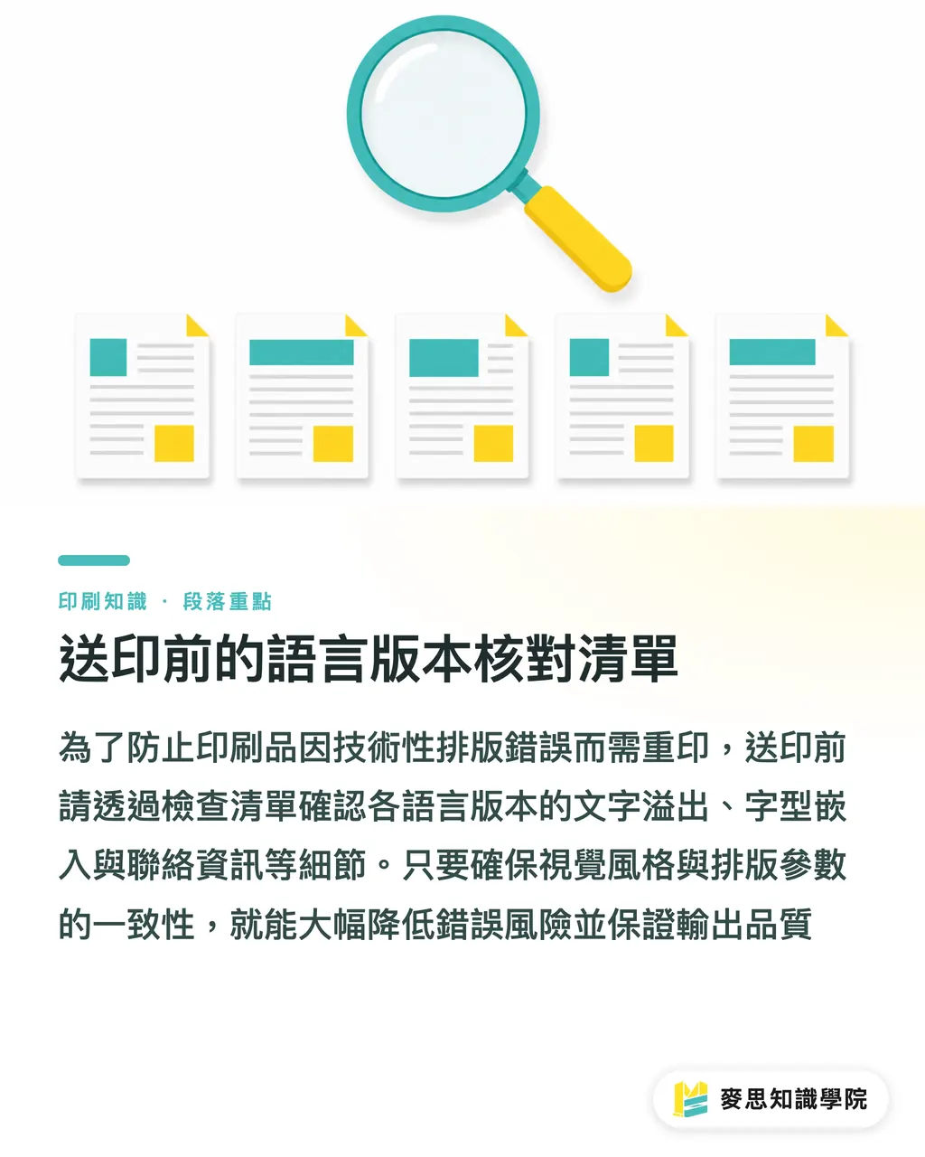
Pre-print language version checklist
・Before integrating three versions of the DM for print, I have the habit of checking these points one by one:
・Layout category:
・No overflow in text boxes for any language version (InDesign's overset text alerts must be cleared)
・Page size and Bleed settings are consistent across all three versions; nothing has shifted due to language switching
・Pictures, LOGOs, and barcodes are not accidentally covered by text boxes
・Text category:
・Brand names and model numbers are spelled consistently across all three versions
・The Katakana brand name in the Japanese version has been manually verified
・Technical terminology has been reviewed by someone with language proficiency or industry knowledge
・Phone numbers, Emails, and URLs are identical across all three versions (this is where subtle errors most easily occur due to copy-pasting)
・Font category:
・Japanese fonts have been embedded and are not just being barely displayed using Chinese fonts (missing glyph issues are very common in Japanese)
・English font weights (Bold / Regular) haven't changed due to language switching
・Final step:
・After exporting the PDFs for all three versions, view them side-by-side in the same window to confirm visual style consistency
・This checklist won't help you catch semantic errors in translation, but it can prevent layout and technical mistakes, which are the direct causes of mass reprints
Key Takeaways
・English copy is 30-40% longer than Chinese; leave margins in text boxes at the design source, rather than waiting for the layout to break before changing it
・AI translation is suitable for quickly producing first drafts, but technical terms, brand names, and regulatory labels must be manually checked
・The punctuation spacing and paragraph settings for Japanese layout cannot use Chinese style settings; font embedding must also be confirmed separately
・'AI first draft, human supplementation' is currently the most time-saving and safe workflow for multi-language completion
・For pre-print language verification, the focus isn't just on whether the text is correct; technical layout items (overflow, bleed, fonts) must also be checked one by one
Extended Thinking
・If your company has regular exhibition needs every year, it is worth establishing a 'Multi-language Brand Glossary': organize product names, core technical terms, and key sentences for company introductions into fixed Chinese-English-Japanese reference versions, so that every exhibition's copy starts from this glossary. The clearer the context received by AI translation, the higher the quality of the first draft, and the shorter the time needed for manual review
・On the designer's side, it is recommended to manage Master Pages and paragraph styles for multi-language versions separately; do not let the three languages share the same set of styles. When switching languages, handle the differences in fonts, letter spacing, and line spacing through style switching, which is much more stable than manual adjustment every time
・MINDS Printing provides print-ready review and print integration services for multi-language DMs. If your team lacks Japanese layout experience, or if you need to ensure three versions are synchronized and sent to print in a short time before an exhibition, you can directly hand this link over to a professional team that has experience in handling export exhibition print materials
FAQ
- Can AI-translated DM copy be sent directly to print?
- It is not recommended to send it directly to print. AI translation is suitable for quickly producing first drafts, but brand names, technical terms, and regulatory labels must be proofread by humans with language proficiency before sending to print; otherwise, using wrong terms or inconsistent spelling of brand names will lead to reprinting the entire batch
- Why does the layout of the English version of a DM often blow up?
- Because English sentences typically have 30-40% more characters than their Chinese counterparts. A text box that was perfectly laid out for Chinese will almost certainly overflow when switched to English. The solution is to leave margins in the text boxes during the design stage and simultaneously ask AI to generate a concise version of the English copy rather than compressing the layout afterwards
- How does the layout of a Japanese DM differ from a Chinese one?
- The main differences lie in three aspects: the logic of punctuation compression is different, the paragraph visual density is lower and requires adjustment of letter and line spacing, and brand names must be marked with Katakana and need manual confirmation of common spellings. Japanese fonts must also be embedded separately and cannot be replaced by Chinese fonts for display
- In multi-language DM production, which stage is the most prone to errors?
- The most common problems are contact information such as phone numbers, Emails, and URLs. It is very easy to introduce subtle differences (an extra space, a missing digit) when copy-pasting between three versions. Before sending to print, be sure to compare the contact information of the three versions word by word
- How much lead time is needed to send Chinese, English, and Japanese DMs to print simultaneously?
- If the designer has experience with multi-language layout and the translations are ready, it takes about two to three working days from the completion of the Chinese version to the finalization of the three-version proofing. If this is your first time doing a Japanese version, it is recommended to reserve at least five days to allow for buffers in re-layout and terminology confirmation