Why do the colors of AI-generated artwork drift when printed?
In the last six months, my office desk has been piled high with AI artwork brought in by clients. While they say, 'Look how beautiful this is,' their eyes reveal a hint of unease. What they are actually asking is: 'Can this really be printed?'
Nine times out of ten, the answer is: 'No, at least not exactly as you see it on your screen.'
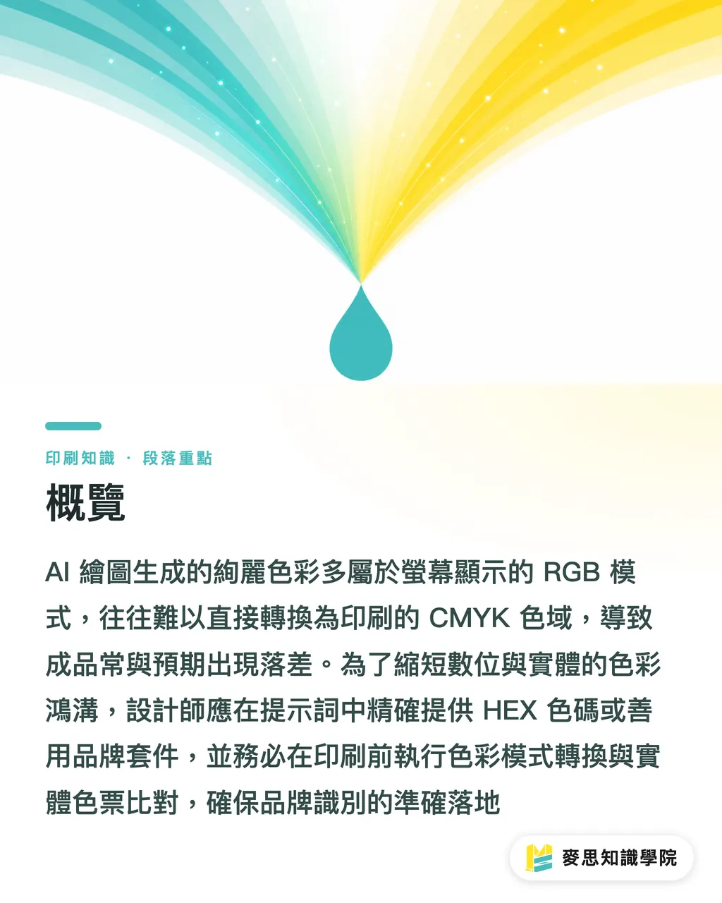
This is not the fault of AI, nor is it the printing factory being difficult; it is simply that there is an inherent color gap between digital and physical media. In this lesson, I am going to teach you how to build a bridge across that gap
Why are AI-generated colors always slightly off?
The root of the problem is simple: AI thinks differently than a printing press
AI image models, such as Midjourney, Stable Diffusion, or tools built into Canva and Adobe Firefly, learn from hundreds of millions of digital images on the internet. These are all created using the RGB color mode—the mode used by your screen and phone to emit light—which has a wide color gamut and vivid colors
However, printing uses CMYK (Cyan, Magenta, Yellow, Black) subtractive color mixing, or more precisely, Pantone spot colors. The color gamut is inherently narrower than RGB. Many dazzling fluorescent colors and royal blues seen on a screen simply cannot be printed on paper
AI does not understand Pantone color codes, nor does it understand the physical limits of CMYK ink overlay. If you give it a brand logo, it will 'understand' the color and generate a color that 'looks similar' in the RGB world. But this 'similarity' is visual, not a data-precise replication, which is a major weakness in brand identity
How to make AI image generation more compliant with brand color standards?
How to 'calibrate and regress' brand colors within AI tools in advance
Although we cannot 100% command AI, we can give it clearer 'suggestions' during the image generation stage to pull it back onto the track of brand colors
・Make good use of the built-in Brand Kit
Tools like Canva or Adobe Express have a 'Brand Kit' feature. This is your first line of defense. Set up your brand's primary colors, secondary colors, and fonts. When you use AI functions, it will prioritize colors from your brand palette. This does not mean it will only use these few colors, but it does significantly improve the accuracy of the generated results. Think of it as giving AI a box of crayons of a designated brand; it will likely start using these first
・Provide color codes directly in the Prompt
Another method is to describe colors more specifically in the prompt. Instead of 'a blue background,' it is better to write 'a background in navy blue, HEX #000080.' By giving it the HEX color code (web hexadecimal color code) directly, the AI's understanding will be more precise than vague color adjectives
But remember, this is still a 'suggestion,' not a 'command.' AI will still look for the closest color within its vast RGB color gamut to interpret it, so the results still need to be verified
What color verification steps must designers follow when printing AI files?
Four steps for color comparison that designers must do before AI files go to print
Once AI produces a preliminarily satisfactory image, never save and send it for printing immediately. The next part is the key moment for designers to demonstrate professionalism and ensure color consistency. I call this process the 'Brand Color Landing Quadruple Confirmation':
・Step 1: Preliminary screen comparison
On a calibrated professional screen, place the AI image you generated side-by-side with your original brand VI guidelines and view them. Check with the naked eye first. This stage is for quick screening; if the difference is too large, it should be directly eliminated or regenerated
・Step 2: Manually convert to CMYK mode
Import the RGB image file into Adobe Photoshop or Illustrator and directly convert the file's color mode from RGB to CMYK. In this step, you will witness the 'truth of color' with your own eyes. Many vibrant colors will instantly become dull or shifted. This is the normal phenomenon of color gamut compression, and also where most people are shocked, but this step is necessary as it lets you preview what is closest to the print result
・Step 3: Compare with physical color swatches
Take your physical Pantone or CMYK swatch book and compare it with the image file converted to CMYK on the screen. This is the most accurate standard because screens have backlighting, which itself affects color judgment. Only physical swatches can tell you what this CMYK value will look like when printed on paper. If the color difference is too large, you have to manually adjust the color curves or values in Photoshop
・Step 4: Apply for digital proofing
After adjusting to your satisfaction in the software, the last—and most secure—step is to apply for digital proofing from your printing house (such as ours, MINDS). We will use professional digital printing equipment to print samples on the same paper stock as your bulk production. This sample is the final basis for your signed confirmation; it reflects the true results of the interaction between ink, paper, and the printing press
Why is proofing indispensable for high-value printed materials, even with AI assistance?
Why, no matter how powerful AI is, proofing cannot be skipped for high-value printed materials
I know that an extra proofing procedure has time and monetary costs. Some clients ask: 'AI is so smart now, can't we skip it?'
My answer is: Absolutely not, especially for cases with high unit prices and high demands on brand image, such as hardbound book covers, packaging boxes for brand products, and cosmetic outer boxes
AI accelerates your 'creative brainstorming' process; it is a junior designer with an endless source of inspiration, but it cannot be responsible for 'production precision.' The process of proofing buys an insurance policy, ensuring that your bulk production orders, which cost hundreds of thousands or even millions, will not be completely scrapped and reprinted due to a small color difference. That kind of loss is far greater than the cost of proofing
Imagine a lipstick brand where the red of the outer packaging does not match the color of the lipstick itself—this is the beginning of a sense of distrust for consumers. Therefore, treat AI as your capable assistant, but the final quality control must return to the most traditional and reliable professional printing workflow
Key Takeaways
・AI image models think based on the screen's RGB color, which is fundamentally different in principle from the CMYK ink or Pantone spot colors used in printing
・Setting up a Brand Kit in Canva or Adobe tools and adding HEX color codes to prompts can effectively guide the direction of AI-generated colors
・Before AI-generated images go to print, they must go through four steps: screen comparison, conversion to CMYK, comparison with color swatches, and digital proofing to ensure color accuracy
・For high-value printed materials such as hardbound books and brand packaging, AI cannot replace the necessity of physical proofing. Proofing is an insurance policy to avoid expensive bulk production errors
Extended Thinking
The impact of AI on the design and printing industry is not replacement, but rather a redefinition of professional value. The role of the designer has shifted from a pure creator to one that also includes the responsibility of an 'AI Content Quality Controller.' You need to know how to guide AI, and even more importantly, how to verify whether the results it produces meet professional production standards. This color management workflow is a professional skill that designers cannot lack in the new era
For us printing factories, this means that educating clients has become more important than ever. We need to help clients understand the limitations of AI tools and provide professional color management services from digital files to physical products—from consultation, proofing, to final printing—to ensure that brand value is not lost in the last mile. This is exactly what MINDS has been doing: being the client's most reliable production partner
FAQ
- Can I input Pantone color codes directly into AI prompts?
- No, current mainstream AI image models cannot directly recognize Pantone color codes; they operate in the RGB world. You should find the closest HEX or RGB values for that Pantone color code to guide the AI, and then manually calibrate it in subsequent design software
- Why is the color I see on the screen always different from what is printed?
- Because screens use RGB (additive color mixing) to emit light, which makes colors vivid, while printing uses CMYK (subtractive color mixing) inks printed on paper that absorbs light. The color gamut ranges of the two are different. When converting from RGB to CMYK, many vibrant colors are compressed because they exceed the printing color gamut, so they naturally appear duller
- If I set up a Brand Kit in Canva, will the colors generated by AI be accurate?
- It is not guaranteed to be 100% accurate. The Brand Kit will 'strongly suggest' that the AI use your brand color palette, which greatly improves accuracy. However, when AI generates complex images, it may still create some neighbor colors or gradients that are 'inspired by your brand colors' for the sake of visual coordination. Therefore, human review and proofreading remain steps that cannot be omitted
সংশ্লিষ্ট নিবন্ধ
- ব্র্যান্ড কালার সিস্টেম তৈরি করা: লোগো থেকে প্রিন্টিং পর্যন্ত, একবারেই কালার ম্যানেজমেন্ট সম্পন্ন করুন
- AI ইমেজ আপস্কেলিং কি প্রিন্টের জন্য উপযুক্ত? Topaz এবং Adobe-এর প্রিন্টিং সীমাবদ্ধতার বাস্তব পরীক্ষা
- AI প্রি-প্রেস চেকিং কি নির্ভরযোগ্য? একজন অভিজ্ঞ পরামর্শদাতা আপনাকে মানুষের ও AI-এর সমন্বয়ে কাজের ভুল এড়ানোর উপায় শেখাবেন