
COMPLETE GUIDE
印刷デザイン完全ガイド:フォント、配色から入稿データの作成まで。印刷されてこそデザインは完結する
画面上でどんなに美しく見えても、印刷で失敗すればそれはただの紙屑です。印刷デザインとデジタルデザインとでは、思考の前提がまったく異なります。色空間の違い、解像度の基準、さらにはフォントライセンスに潜む罠まで、すべてが異なります。本ガイドでは、仕様の決定、フォントや配色から、入稿データの作成、そして色校正や検収までの一連のプロセスを網羅し、すべてのデザインデータを実際の印刷工程にそのまま耐えうる品質へと仕上げるためのノウハウをお届けします
仕様を固める:サイズ、印刷部数、予算がデザインの自由度を決める
デザインを始める前に「仕上がりサイズと折り方」「想定部数」「加工予算」の3点を確実に決定します。サイズはレイアウトの骨組みや塗り足しの設計を左右し、部数はオンデマンド印刷かオフセット印刷かの選択を決定づけ、カラー戦略に直接影響します。そして予算は、箔押しや型押し(エンボス)といった付加価値を高める加工を採用できるかを決めます
順序を逆にしてしまうと、悲劇が待っています。デザインが終わってから、サイズを合版印刷の規格に合わせる羽目になったり、特色を諦めてプロセス4色に変えざるを得なくなったり、予算オーバーで型抜き加工が削られたりするのです。仕様の策定はデザインの土台であり、データ入稿直前に確認するチェックリストではありません
DEEP DIVEチラシデザイン 6つのステップ完全プロセスフォント:選定、組み合わせ、ライセンスの3つの関門
印刷におけるタイポグラフィの要諦は、最終的な仕上がりにあります。本文の文字サイズが6ptを下回ると可読性はギャンブルになり、細い明朝体の横線やセリフは、白抜き文字にした際に潰れたりかすれたりしやすく、画面上で適切に見えた行間も印刷すると窮屈に感じられがちです。組み合わせにおいては「一顕一正(個性を出す見出しと、定番の本文)」の原則を守りましょう。使うフォントファミリーは2つもあれば十分です
ライセンスは、デザイナーが最もトラブルに巻き込まれやすい落とし穴です。個人利用ライセンスは商用利用を意味しませんし、PDFへの埋め込みやアウトライン化がライセンス規約上、全く別の扱いになっていることもあります。入稿前に各フォントの商用利用許諾範囲を確認し、少しでも確証が持てない場合は、必ずアウトライン化を行い、手元に編集用のオリジナルファイルを残しておきましょう
DEEP DIVE印刷タイポグラフィ:文字サイズ、行送り、白抜き文字まで、画面と仕上がりの視覚的な落とし穴を避けるカラー:RGBではなくCMYKで思考する。画面に騙されてはならない
画面はRGB(加法混色)、印刷はCMYK(減法混色)であり、表現できる色域が根本的に異なります。蛍光色のような鮮やかな緑や青は、印刷すると確実にかすんでしまいます。デザインの初期段階からドキュメントをCMYKで作成するか、少なくとも色校正を行って仕上がりを予測し、出力してからブランドカラーが完全に狂っていることに気づくような事態を防ぎましょう
ロットが違ってもブランドカラーの一貫性を保つためには、印刷現場での色彩規格を事前に定義しておく必要があります。塗工紙と非塗工紙のそれぞれに合わせたCMYK値を設定するか、特色を指定し、重要な案件では印刷機にかける前にデジタル校正を確認します。カラーシステムが強固に作られていれば、用紙や印刷会社が変わっても色がブレることはありません
DEEP DIVEAI生成画像の色がズレる?ブランドカラーを固定する印刷色彩管理の実践レイアウト:グリッド、余白、情報階層の設計
印刷のレイアウトは、一度刷ったら変更できない静的なメディアです。スクロールもホバーアクションも存在しないため、情報の階層構造は一目で認識できなければなりません。グリッドを使ってリズムを生み出し、文字サイズのジャンプ率と余白によって主従関係を明確に分け、読者の視線をスムーズに誘導しましょう
余白は紙の無駄遣いではなく、高級感を生むための素材です。要素がぎっしり詰まったレイアウトは、画面上ではそれらしく見えても、実物になると安っぽさが際立ちます。重要な情報の周りに十分な余白(視覚的な息抜きのスペース)を持たせることは、文字をただ大きくするよりもはるかに効果的です
DEEP DIVEAIでデザインブリーフをレイアウト設計へ:デザイナーの修正を3往復減らす前工程用紙と特殊加工:紙質と加工技術をデザインの要素として捉える
用紙の白色度、塗工状態、手触りは、仕上がりの色や質感を完全に変えてしまいます。同じデザインでも、コート紙に刷るか特殊紙(ファンシーペーパー)に刷るかで全く別の作品になります。用紙の選定は印刷会社任せにするものではなく、デザイン決定の重要な一部です。どの用紙に着地させるかを想定しながら、デザインを進めなければなりません
箔押し、エンボス(型押し)、スポットUVといった特殊加工は、「引き算の美学(少にして的確)」が求められます。視線の焦点を1点に絞って効果的に施す方が、あちこちに散りばめるよりもはるかに力強い表現になります。また、特殊加工には専用の版が別途必要になるため、デザインデータ上で加工範囲を別レイヤーに分け、明確に指定しておく必要があります
DEEP DIVEスポットUVで高級感を出す入稿術データ作成と入稿:塗り足し、アウトライン化、エラー防止策
完璧な入稿データを作ることは、デザイナーのプロとしての信用そのものです。「塗り足しの確保」「セーフティエリアへの配置」「画像の有効解像度の確認」「フォントのアウトライン化または埋め込み確認」「配置画像の収集」。これら5つのポイントのうち、どれか1つでも抜けていると、それまでの苦労がすべて台無しになりかねません
印刷会社がデータを見て「迷わない」状態に整えて引き渡します。ネイティブデータではなく、印刷用PDFを出力し、仕様書(サイズ、用紙、加工, カラー要件)を添え、特殊加工がある場合は仕上がりのイメージ図を添付します。無駄なやり取り(コミュニケーションコスト)を減らすことが、そのまま最終的な印刷品質の向上に直結します
DEEP DIVEデザイン入稿で失敗しない!フォント著作権リスクとパッケージング・アウトライン化の完全ガイド色校正と検収:デザイン通りの美しい仕上がりのために
色校正は、デザイナーにとって唯一の「失敗を防ぐための最終ライン」です。簡易校正でカラーの方向性を確認し、本紙校正で実際の紙の質感や加工の仕上がりをチェックします。重要な案件では、校正費用を惜しんではいけません。刷り直しにかかるコストは校正費用の比ではなく、何より失うのは納期と信頼だからです
校正チェックでは以下の点を確認します。ブランドカラーが合っているか、細い文字が潰れていないか、特殊加工の位置が合っているか、断裁時に重要な要素が切れないか。問題がないことを確認し、署名(校了)して本刷りへと進めることで、納品後に生じる色ブレや仕上がりのトラブルに対して、明確な判断基準を持てるようになります
DEEP DIVE特殊加工の校正サンプルで何を見る? 箔押し・エンボス・抜き加工のトラブル回避ガイド関連記事
Logoデザイン費用はどう見積もる?デザイナー vs デザイン会社の料金構造を解説
Logoデザイン費用で主に買っているのは、ブランドアイデンティティの戦略判断、視覚シンボルのオリジナル発想、そして今後数年間の長期的な利用権益の3つです。MINDS(MS)はお客様から「なぜLogoひとつで何万元もかかるのか」とよく聞かれます。理由はここにあります。安いデザイナーは、素材集のデータを少し引っ張ってきて、少し直し、vectorファイルを渡して終わりにするだけかもしれません。一方、正規のプロセスでは見た目だけでなく、市場ポジショニング、競合分析、フォントライセンス、アートワーク展開、商標登録の検討まで含まれます
AIでデザインブリーフをレイアウト設計へ:デザイナーの修正を3往復減らす前工程
営業資料や製品資料をそのままデザイナーに渡すことは、ほぼ毎回、大幅なデザイン修正の出発点になる。この記事では、レイアウトに入る前にひと手間加え、AIで文章素材を紙面の情報設計に整理し、見出し、訴求点、CTAの優先順位をデザイン開始前に確認しておく方法を解説する。手戻りのコストを根本から減らすための考え方である

AIはロゴデザインにどう役立つ?生成画像はそのまま使えるのか
多くのデザイナーがAIでロゴの着想を加速させようとする一方で、解像度や著作権の懸念で行き詰まっています。 この記事では、ロゴデザインの企画・初期段階におけるAIの活用シーンを紐解き、印刷入稿前にクリアすべき技術的なハードルを解説します
名刺デザイン費用はどう決まるのか
名刺のデザイン費用は主にレイアウト組版、プリプレスチェック、出力責任の対価であり、Logoのデザイン費用はブランドアイデンティティ、戦略的判断、長期的な運用権利の対価だ。 両者の価格差が大きいのは当然だ。名刺はブランドを 90 × 54 mm の物理メディアに収める作業であり、Logoは今後数年間にわたるブランドの認知され方を決定するものだからだ
AIフォント選定ガイド:印刷ディレクターが教える「感覚頼み」を卒業するタイポグラフィ
フォント選びは平面デザインにおいて最も時間がかかり、迷走しやすい工程です。 本記事では、10年以上の印刷実務に基づき、プロのフォント選定の直感をAIで実行可能なシステム化プロセスへと落とし込む手法を解説します。 AIツールの活用法から、日本語フォント特有の注意点、さらにはプリプレス(印刷前)のチェック項目まで網羅し、画面上だけでなく、印刷物としても美しく精度の高いデザインを実現するためのヒントをお届けします
デザイン入稿で失敗しない!フォント著作権リスクとパッケージング・アウトライン化の完全ガイド
クラウドフォント購読が普及した後、デザイナーの入稿時におけるフォント関連のリスクはより複雑になりました。フォントの断線や欠落は一種の問題で、商業ライセンス不足は別の問題です。どちらも問題が発生した後に説明ができなくなります。この記事は実際の印刷現場の入稿プロセスから出発して、フォント確認、アウトライン化、パッケージング、PDF 出力までの SOP を一度に明確に説明します
印刷タイポグラフィ:文字サイズ、行送り、白抜き文字まで、画面と仕上がりの視覚的な落とし穴を避ける
画面上ではどれほど完璧に見えるデザインでも、文字サイズや行送りの設定を誤れば、印刷物では大きな失敗になる。十数年の印刷実務経験をもとに、この記事では文字設定で押さえるべき重要な安全ラインを率直に示し、デザインを確実に実物へ落とし込み、無駄な再印刷費用を防ぐ
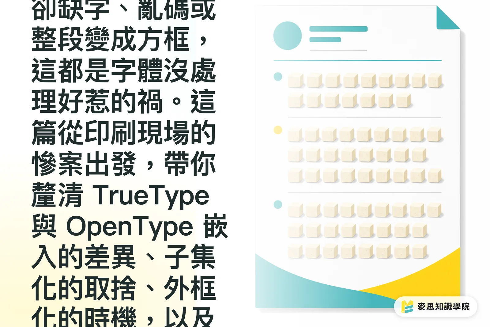
フォントの埋め込み不備で冊子全体がトーフ化するのを防ぐ実践ガイド
印刷の現場で、こんな事例を嫌というほど見てきました。デザイナーが自信満々に入稿したPDFを出力機にかけると、文字がずらりと四角い枠に化け、英文が丸ごと「□□□□」になって出てくる——
印刷用カレンダーの設計方法とは?ベテランアドバイザーによるレイアウトと用紙選定の実践ガイド
毎年6月は、企業が翌年のカレンダー準備を始める重要な時期です。 この記事では、仕上がり仕様や用紙の落とし穴からAIを活用したプロセスまで、実務上の盲点を回避し、美しく書き込みやすいプロ仕様のカレンダーを制作する方法を解説します

チラシデザイン 6つのステップ完全プロセス
チラシデザインは、まず読者が情報を目にする順番を決め、レイアウト、色彩、画像、CTAを整え、最後に印刷仕様のチェックへと戻るのが基本です。 この記事では、MINDS(MS)の「チラシ6ステップ法」を用いて、A4・A5のサイズ選びから塗りたし、CMYK、CTA、入稿前チェックまでを一挙に解説します
化粧箱デザインの実務トラブル回避ガイド
化粧箱のデザインは、まず展開図と折り方向を設計した上で、レイアウトやビジュアル配置に進むのが鉄則です。MINDS(MS)のデータチェック「入稿3段階チェック」では、まず構造、次に印刷、最後に組み立て後の正面の見栄えを確認します。 本記事では印刷現場の実践的なノウハウをもとに、展開図の計画、レイアウトの論理、折りたたんだ際の視覚的バランスを分かりやすく解説し、デザインデータを入稿・製品化により近づける方法を紹介します

デザイナー必見:AIツールで印刷物のデザインフローを加速させるには?
シニア印刷コンサルタントの視点から、AIツールがどのようにデザイン効率を実質的に向上させ、クリエイティブから印刷までの各工程を最適化し、デザイナーが本質的な価値に集中できる環境を作るかについて、観察と実践的な提案をシェアします
印刷 × AI の産業アドバイザー
印刷だけではなく、産業アドバイザーとして、ブランドや企業が「印刷製造」と「AI活用」をつなぐお手伝いをします。入稿・用紙や加工の選定・コスト最適化から、AIを設計と印刷フロー・自動化・DXへ導入するまで
無料相談を予約